Results and project info
Key facts & figures
Outcomes
- System-led approach reduced screen design requirements by as much as 90%, and handover time by at least 75%. A significant reduction in follow-up consultation from the designer inheriting the work was also observed.
Utilising a product-driven solution reduced time-to-market and production costs for the client by as much as 70% and 50% respectively. This opened up the discussion of follow-up work with the client.
During user testing conducted before the beta phase, the interface was frequently complimented for its tasteful and minimal design.
Timescale
4 weeks to define design direction and hand over to the UI designer for implementation
Tools
Sketch, JIRA, Confluence, Slack
Created while working for:
Deltatre (formerly known as Massive Interactive)
The team
Project Lead
Jeff Young
UX Lead
Belen Tahir
UI Lead
Jon Addison
UX Designers
Maike Thorade
UI Designers
Kadriye Gumus
Project overview
Brief
Establish the visual design direction of the BritBox service during the alpha phase of the product.
Project challenges
Internally identified challenges
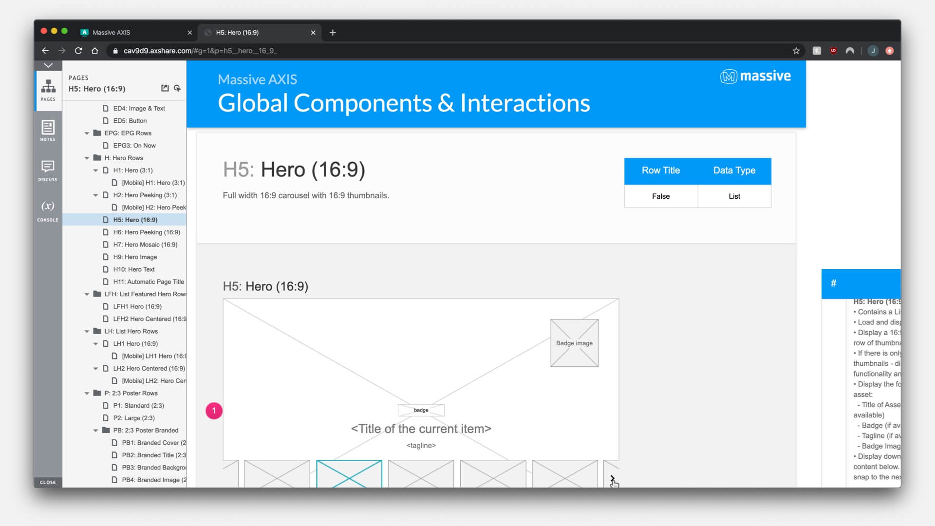
Lack of time & budget to make customisations to the foundation product AXIS, but we still needed to create a distinguished interface
Designer taking over from me and executing detailed designs would have little crossover, so my work would need to be interpretable with a minimal handover
My role in the project
To work with the client to agree on the design direction, which would then be handed over to a UI designer to create detailed designs and style guides for development.
Platforms
Android/iOS
Mobile (all major sizes from 320px up)
Tablet (portrait & landscape)
Responsive Web
All modern browsers supported
Connected TVs
Smart TVs
Android TV
tvOS
Three phase launch
ITV decided to build the new BritBox platform in phases, in order to properly test and analyse the build before the full launch. The phase details were as follows:
Alpha
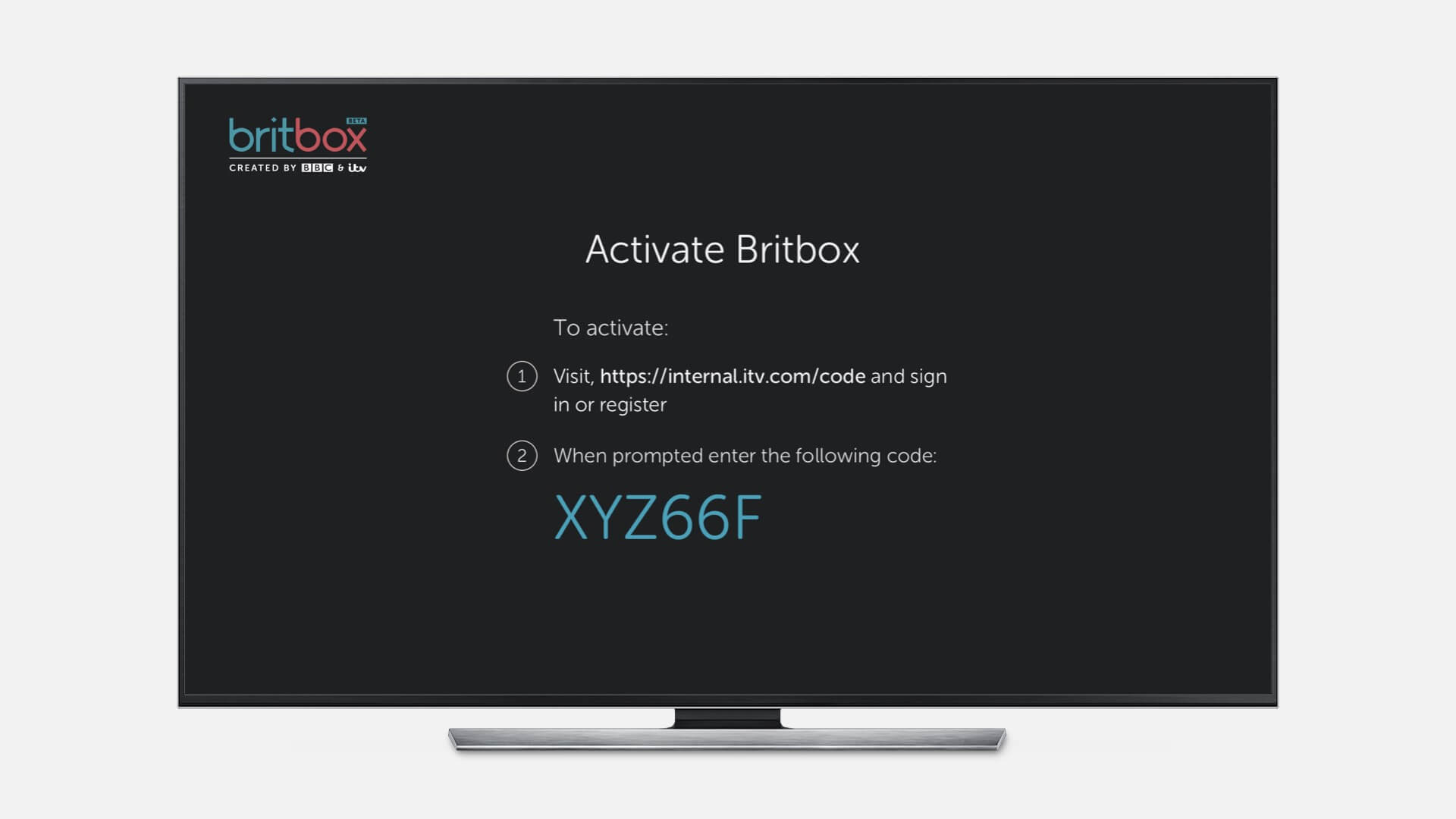
Closed launch to small sample of invited parties only. Basic interface established, built on Massive AXIS platform with no customisations. User testing conducted before beta phase begins.
Beta
Soft launch to a wide sample of invited members of the public. Changes implemented from alpha phase learnings, and requested customisations from client included in product.
Launch
All feedback and new features from Alpha and Beta included for full launch of the platform to the public.
Understanding the brand
The BritBox project had had two other previous launch attempts that unfortunately broke down for business reasons on the client side. This meant I had a very strong understanding of the BritBox branding already, based on previous versions of the service I’d worked on.
In order to prepare for this version of the BritBox product design I read back over all of our past workshop notes, brand guideline documents and past work to refresh my memory of the brand. Due to all of this work being unreleased, unfortunately I cannot feature it here.
Creating a distinguished interface without customising the AXIS platform
In order to get the service to market quickly, the decision was taken to use largely out-of-the-box components. This ensured reliably finishing the project quickly, but posed a fairly large challenge for making the UI direction stand out and feel fresh.
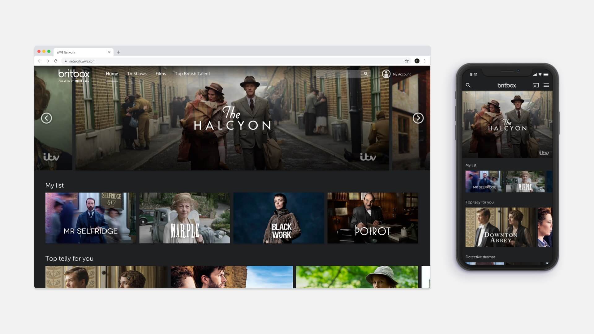
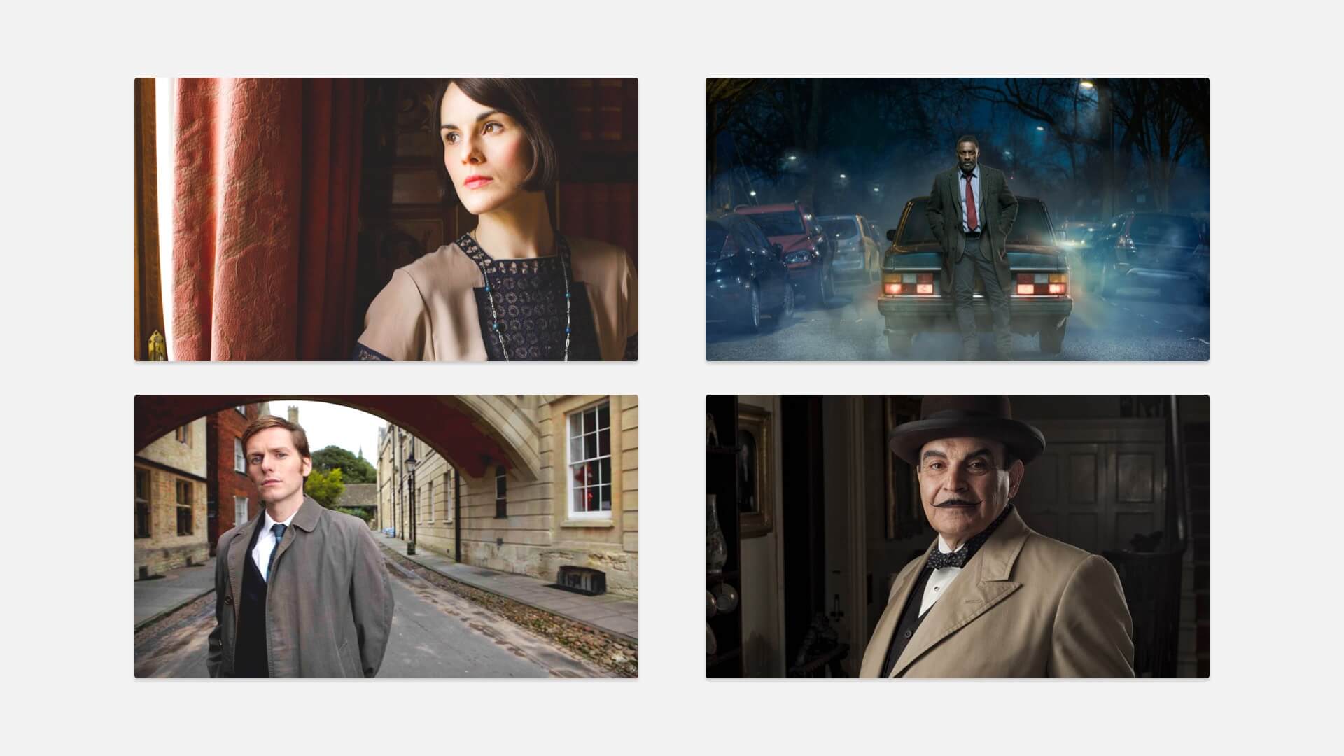
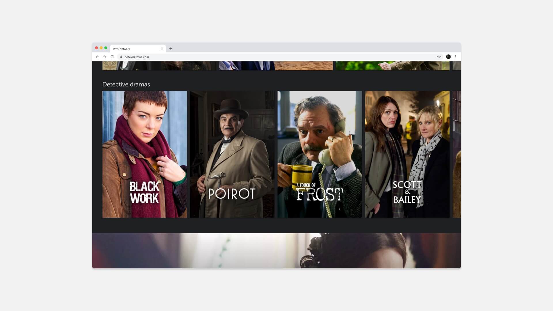
After some quick workshopping with some volunteers from the design team, it was decided that the best way to make the service stand out was to leverage the power of the shows’ imagery, as British TV has a distinct character.
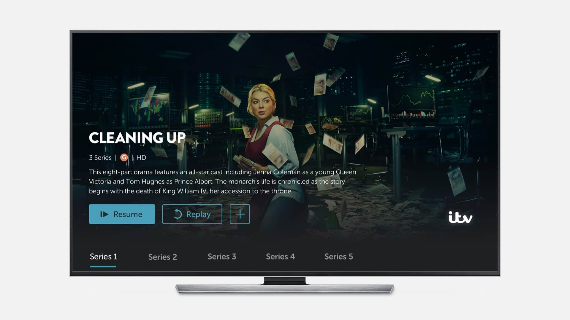
The direction decided upon was to feature intimate visuals of the key talent from each show, highlighting the personality of the character and programme. Shots of the talent looking at the camera were preferable but not mandatory.
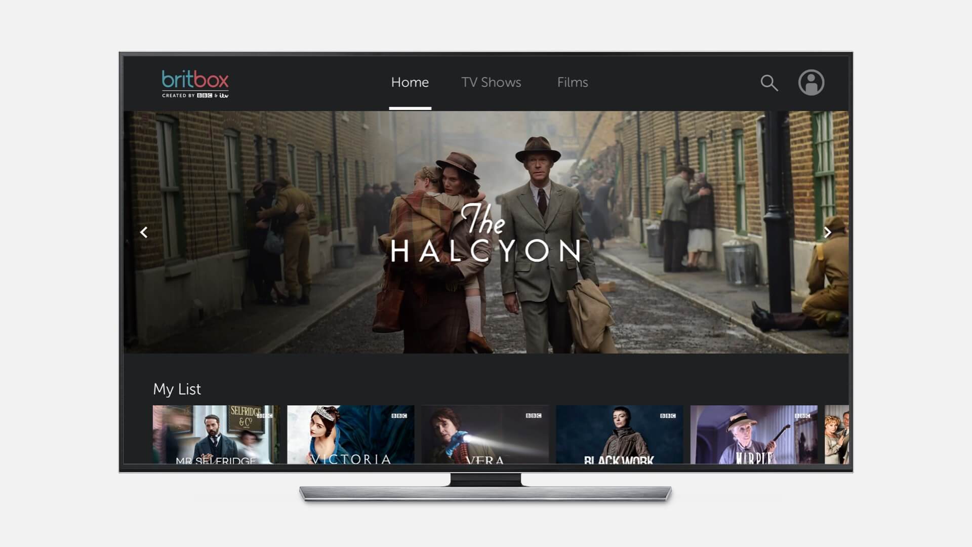
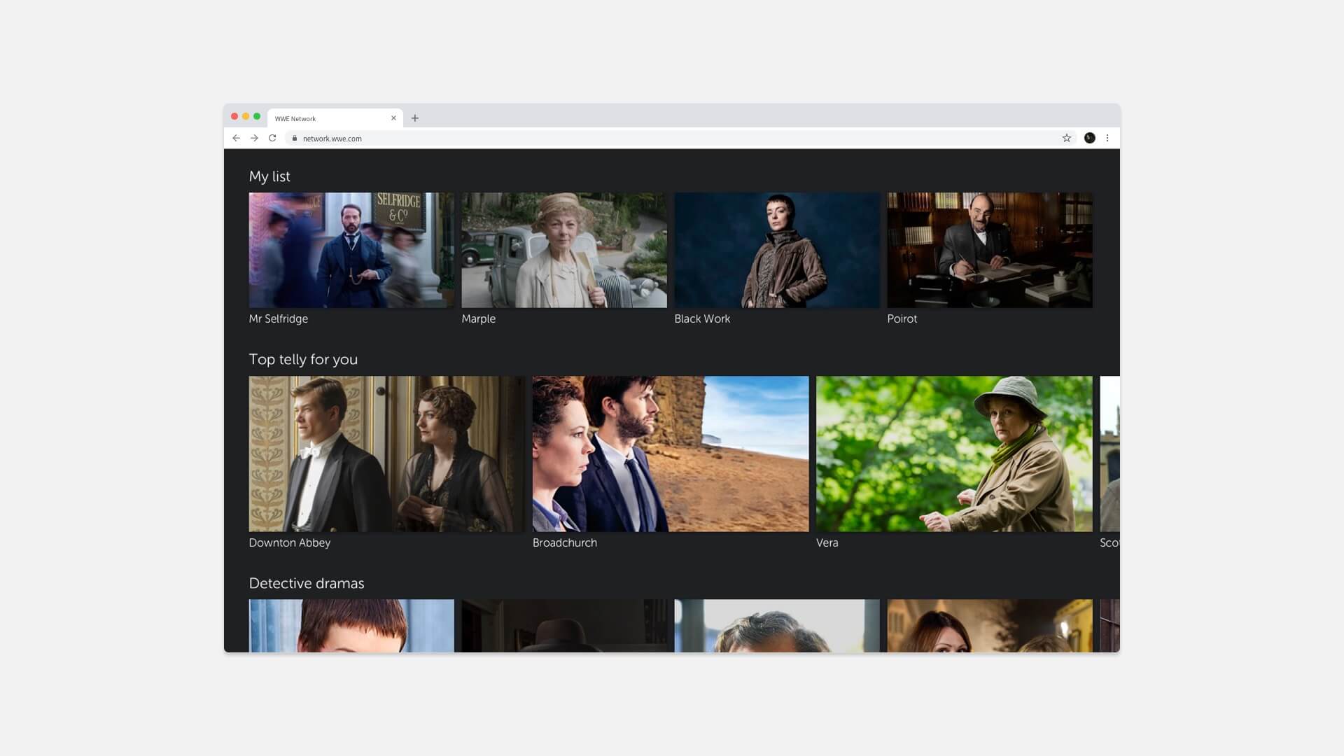
The second key design principle established was to embrace minimalism in the UI, to support the idea of allowing the quality and personality of the content to speak. This meant stripping the homepage of all unnecessary metadata, and instead using logo artwork on the tile, bringing more vibrancy to each piece of artwork. A positive side effect generated from this was that it allowed slightly more content to appear on screen without scrolling.
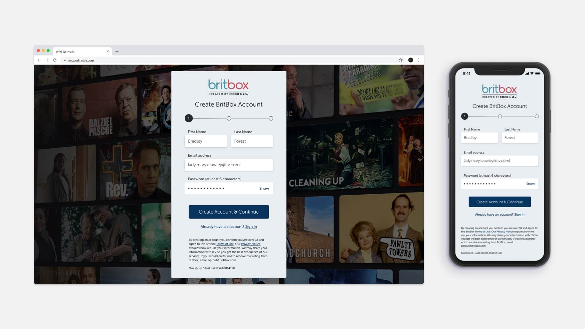
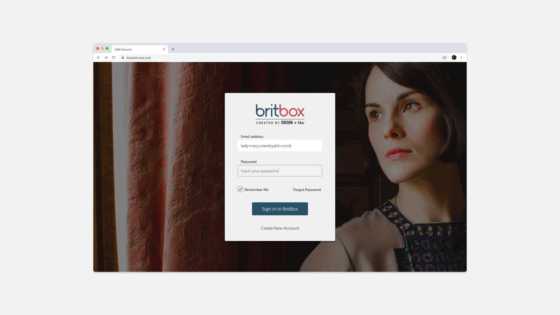
Lastly I produced an outline for the visual style of the Sign & Register sections. Above & left is the original AXIS template – I wanted to produce something that felt unique to BritBox, but would still fall under the bucket of budgeted skinning. I identified the layout as the most costly thing to alter in development terms, so focused my efforts on creating a layered identity with depth.
Leveraging AXIS: choosing out-of-the-box rowtypes to showcase the BritBox content library
BritBox has a fairly extensive content library, however due to the nature of the offering its catalogue is smaller than nonspecific services like Netflix or Amazon. This meant that using standard dense packshot rows became repetitive quickly and the service felt quite bare.
After confirming ITV’s editorial team capacity would be able to support the idea, we decided to leverage more of AXIS’s artistic rowtypes and rows with larger packshots. These row choices, in combination with the aforementioned art direction for images, meant that the service had a more curated and personal quality.
Handing over the design direction for implementation
In order to ensure the vision was understood correctly, I produced a set of handover documentation for the designer implementing the concept. This contained sample screens, explanation of the principles and links to all useful assets & artwork, and was delivered as a Confluence space. I also arranged a workshop session to run through the full design direction in person.
Prototype of end product
More interface samples
