Results and project info
Key facts & figures
Outcomes
- The project met its incredibly tight deadline and allowed WWE to move onto its new partnership contract on time, saving several million dollars in fees.
- New interface and UX features were widely praised by fans and the media.
- WWE were incredibly satisfied with the design process and the amount of involvement & interaction they had with the Massive design team
- WWE gave praise for my design system and handover, which allowed screens to be built using a drag-and-drop system, and reduced screen design output requirements by as much as 75%.
Timescale
6 months from opening workshops to design completion (June-December)
Tools
Sketch, Axure, JIRA, Confluence, Slack, Sympli, Zeplin, Abstract, Principle, After Effects, Keynote
Created while working for:
Deltatre (formerly known as Massive Interactive)
Quotes & reviews
“The service now feels more consistent across platforms, looks far better, and is easier to use as a result of the changes.”
The Verge
“I love how there are not just matches listed, but also Other Promos/Segments”
“The new app UI is very fluid and smooth.”
“I like the superstar pages”
“The searches on this make this a real joy. Being able to search and get not only matches, but news items, moments and events is a real pleasure.”
“It looks amazing”
WWE fans via Reddit
The team
Project Lead
Jeff Young
UX Lead
Jonathan Lees
UI Lead
Jon Addison
UX Designers
Carolina Delgado
Dario Codipietro
Milan Tailor
Nabiha Ahmed
Li Yu
UI Designers
Nicola Hankins
Philip Readman
Patryk Brzeziński
Justin Pybus
Jonathan Gurteen
Project overview
Brief
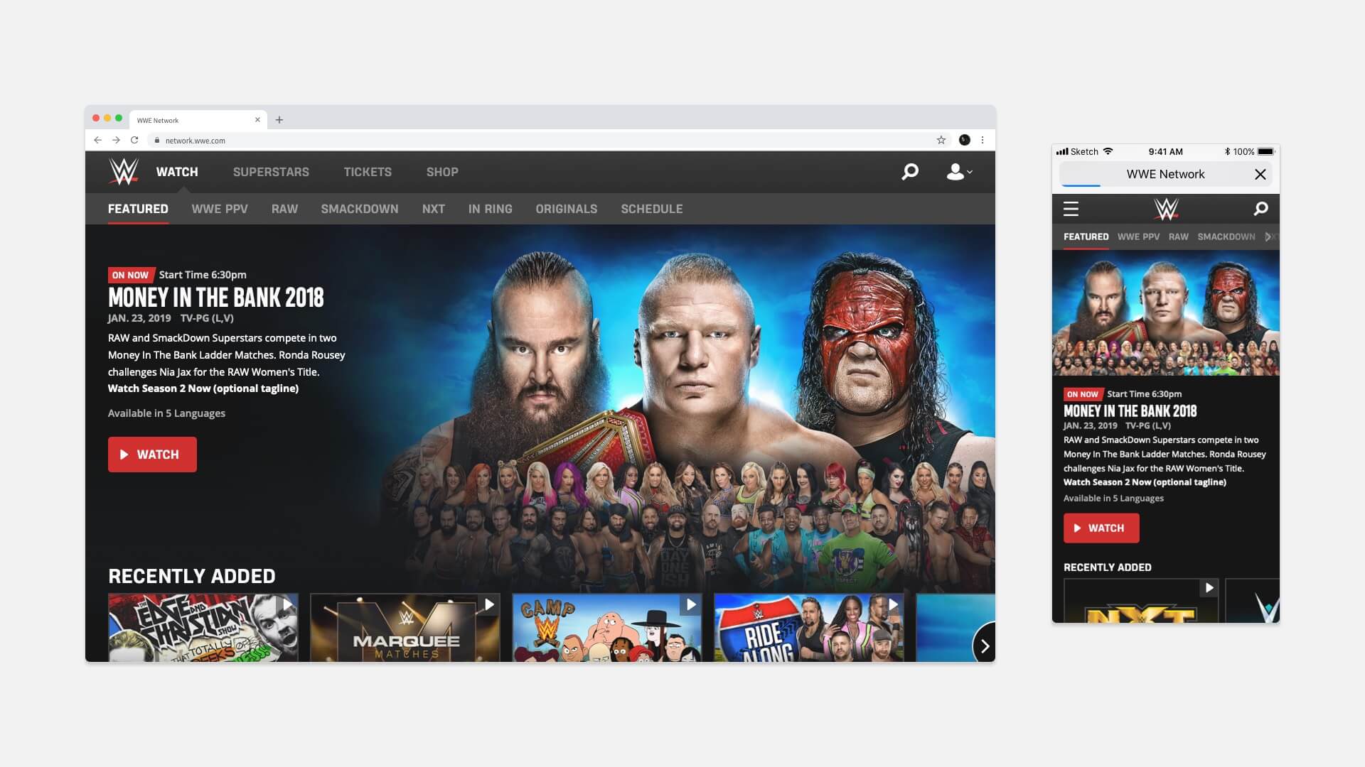
Create a new experience for WWE Network 2.0, that enhances the content experience for existing fans, and attracts new ones to the service.
Business goals & project challenges
Business goals
- Deliver project quickly so WWE can move vendors and not incur heavy fees
- Improve content discoverability
- Improve accessibility standard of design
Internally identified challenges
- Project scale will require careful management to ensure timelines are adhered to
- Collaboration with existing in-house design team will be required to promote confidence that their work is being considered
My role in the project
Lead the UI team in the creation of detailed designs. Audit WWE’s existing flows and wireframes, and create new flows for missing sections. Work closely with the other leads and the client to establish overall direction and attain regular sign-offs.
Platforms
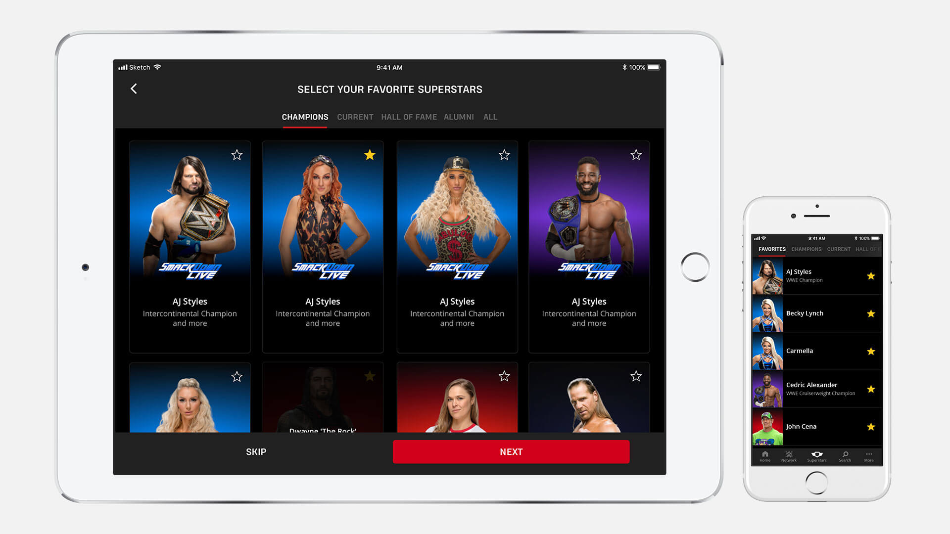
Android/iOS
Mobile (all major sizes from 320px up)
Tablet (portrait & landscape)
Responsive Web
All modern browsers supported
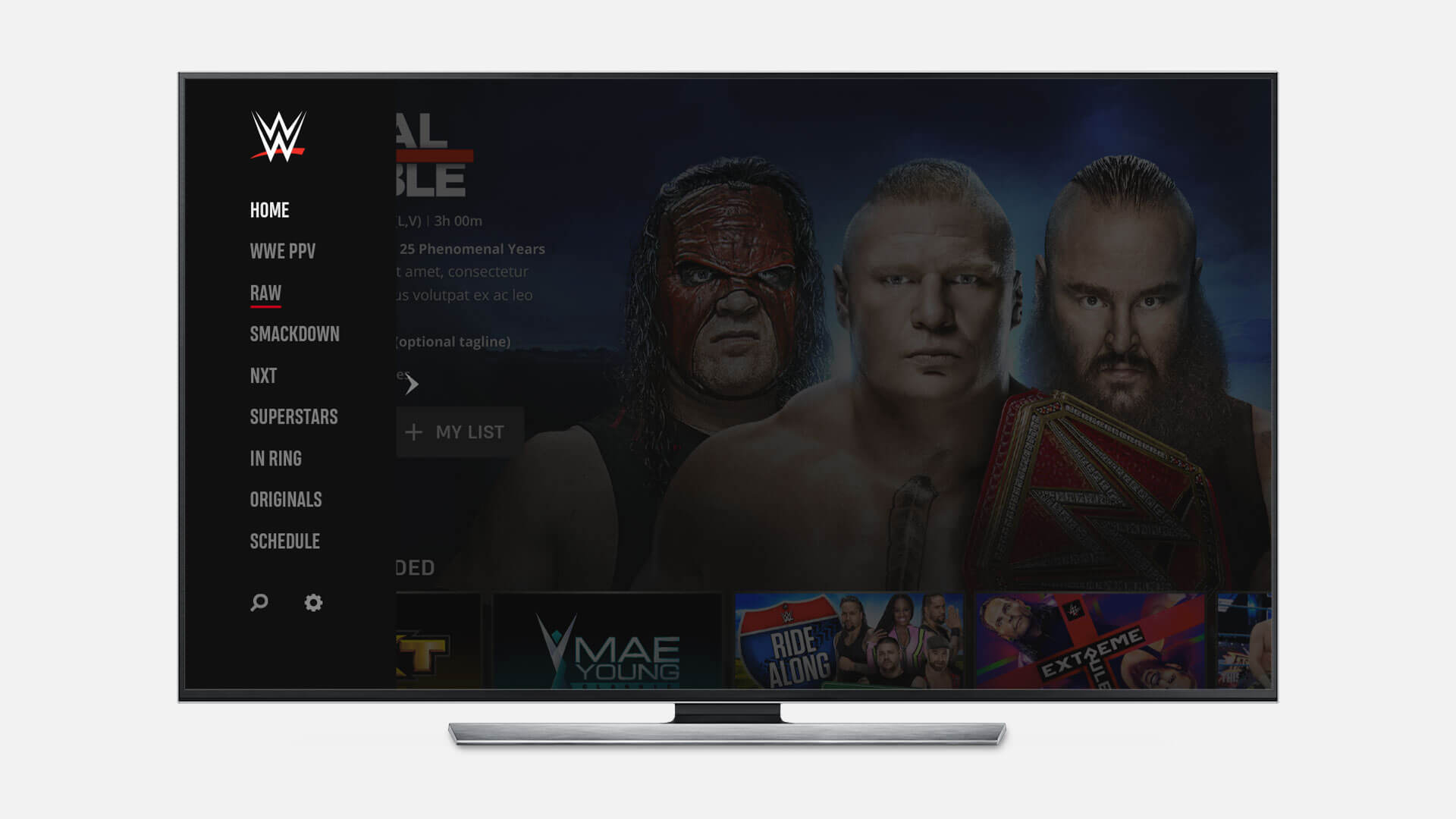
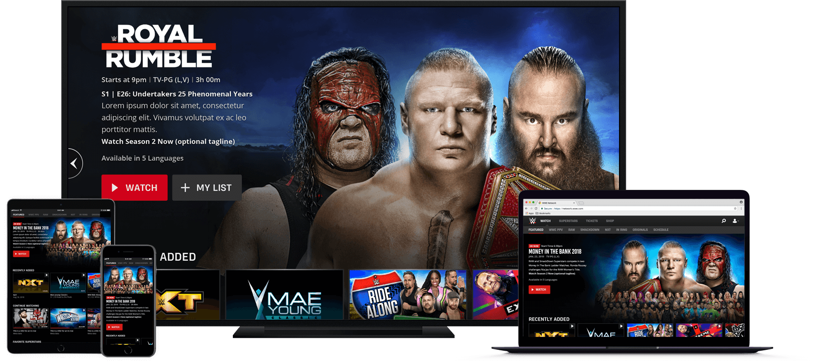
Connected TVs & Games Consoles
Smart TVs (Samsung, LG, Panasonic)
Roku
Android TV
Fire TV
tvOS
Xbox One
PlayStation 4
Chromecast
High velocity project strategy
Phase 1: Discover
- Research WWE brand and content; establish design principles for project
- Audit WWE’s existing UX and UI designs, created before the project by their in-house team
- Establish browsing & navigation patterns for each platform
- Map IA and content metadata
Phase 2: Ideate
- For areas of service without pre-prepared work created by WWE, develop user flow diagrams and create concept wireframes/visuals
Phase 3: Specify
Refine designs and tweak to pass WCAG 2.0 AA accessibility standard
Create detailed UX and UI documentation
Hand over documentation to developers for implementation
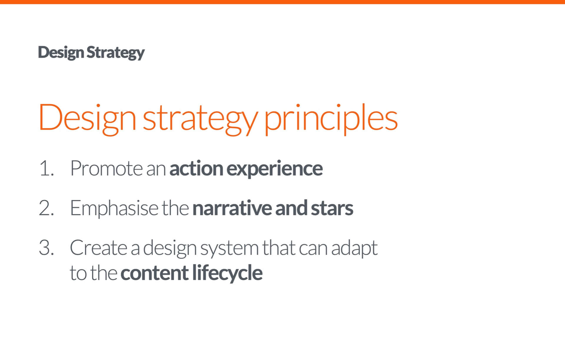
Researching the brand & defining design principles
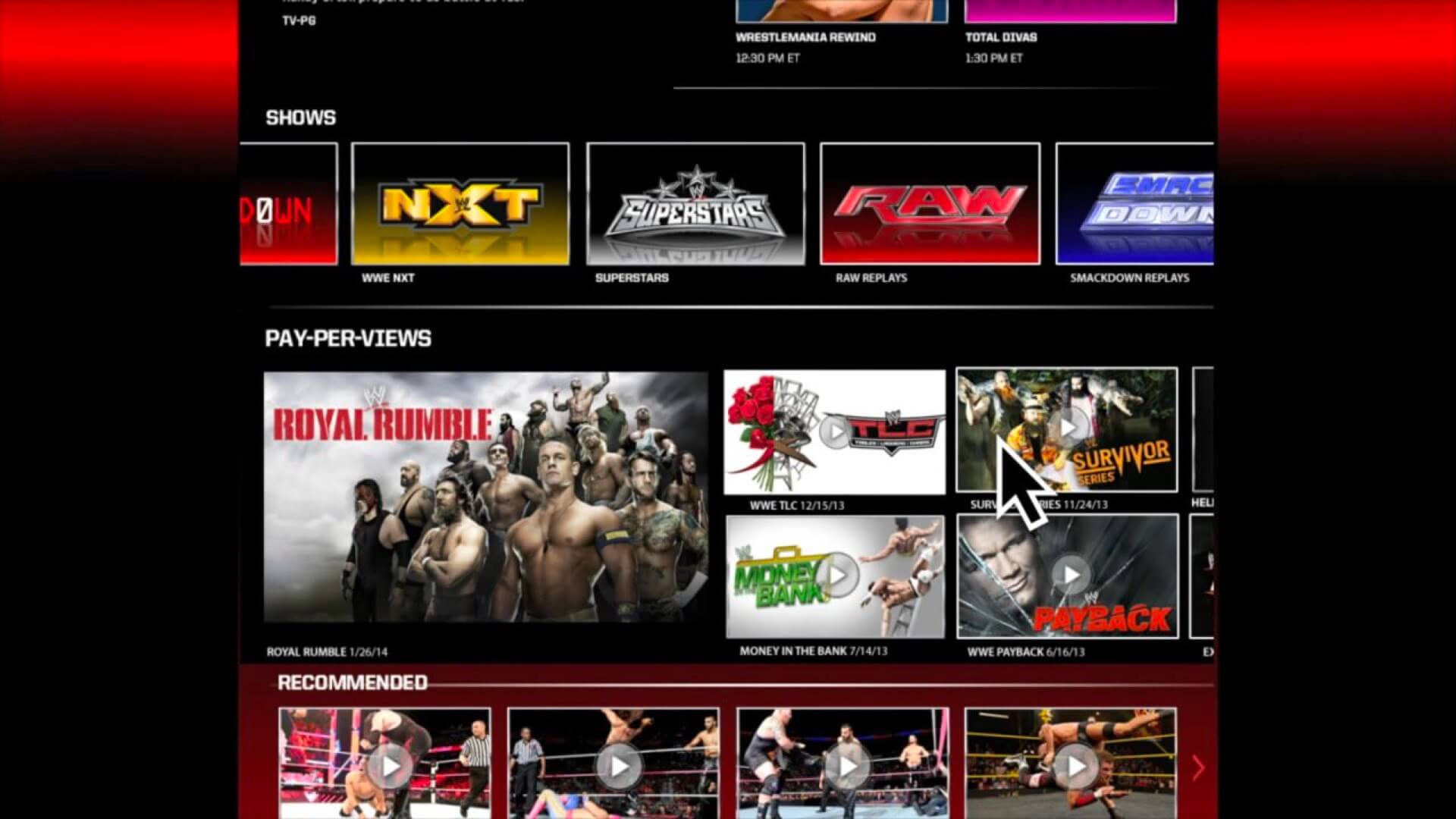
WWE provided multiple 100+ page decks that provided all the brand research we could ever need (this is confidential and sole property of WWE, therefore not pictured here). This documentation provided insight on platform popularity, customer habits and more and was already enough information to create informed design principles from.
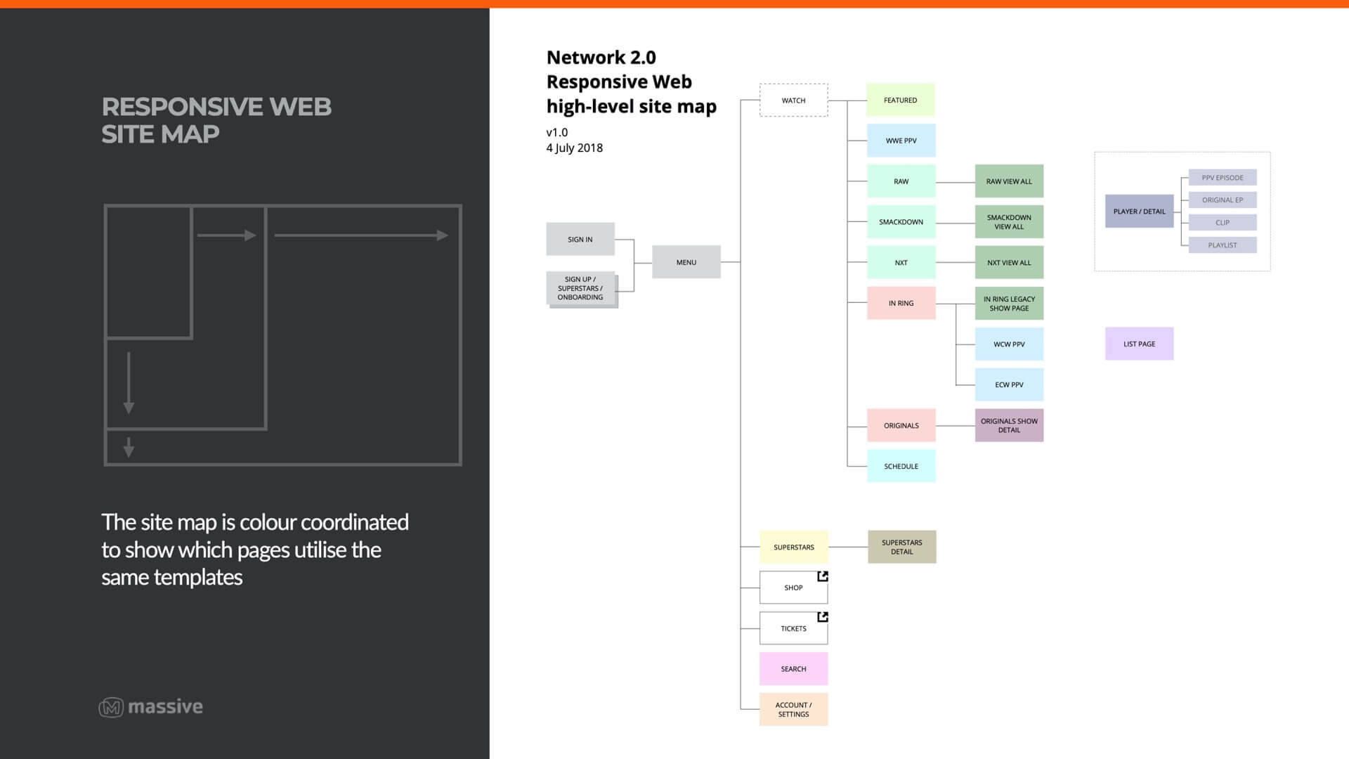
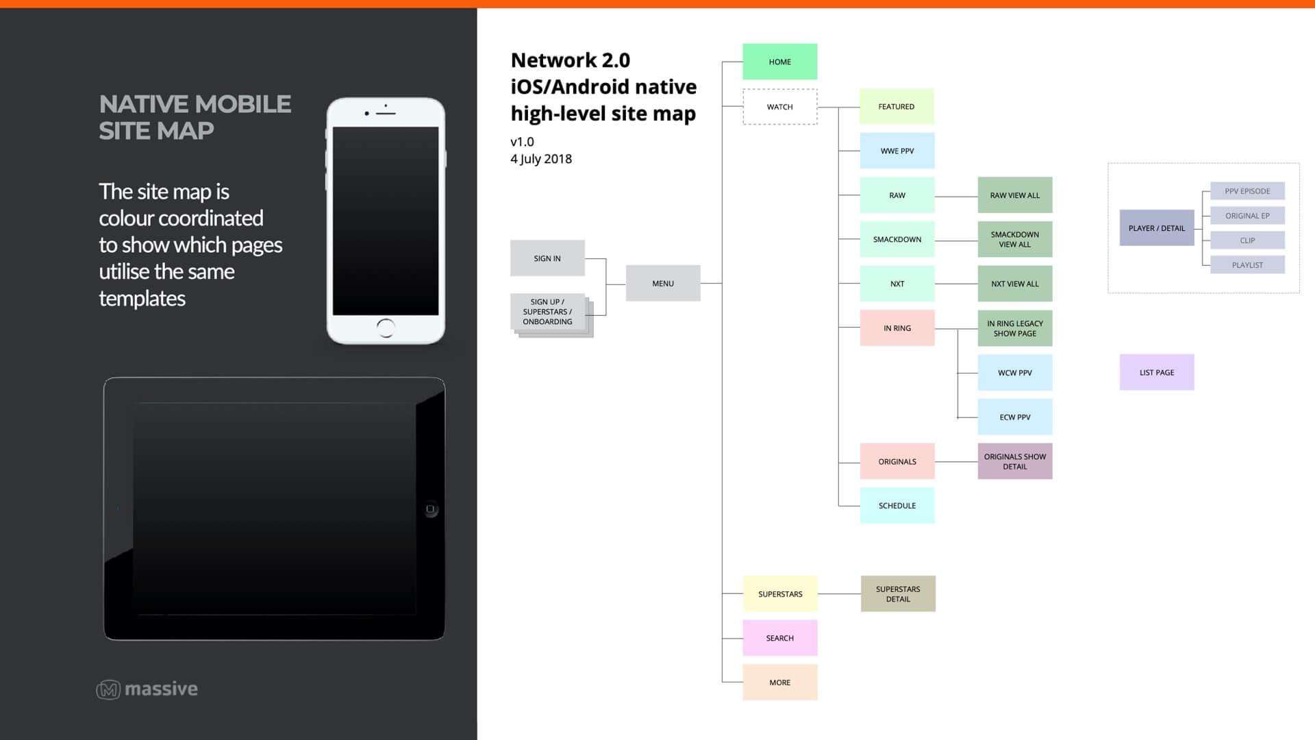
Mapping the IA and metadata
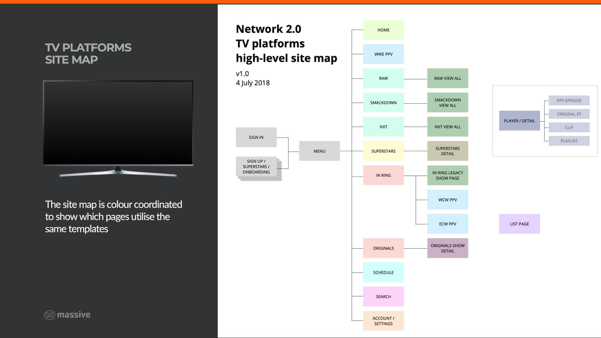
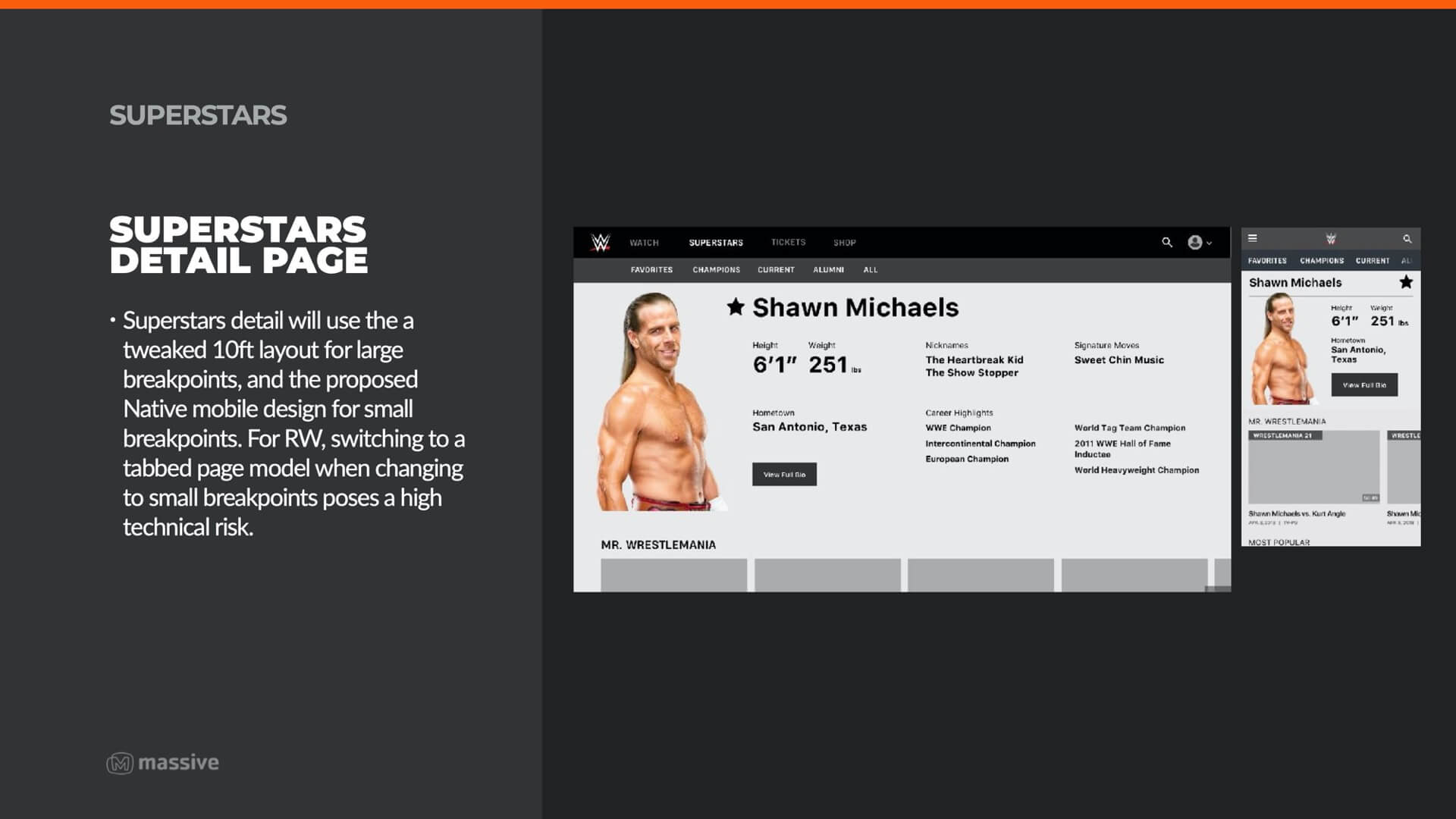
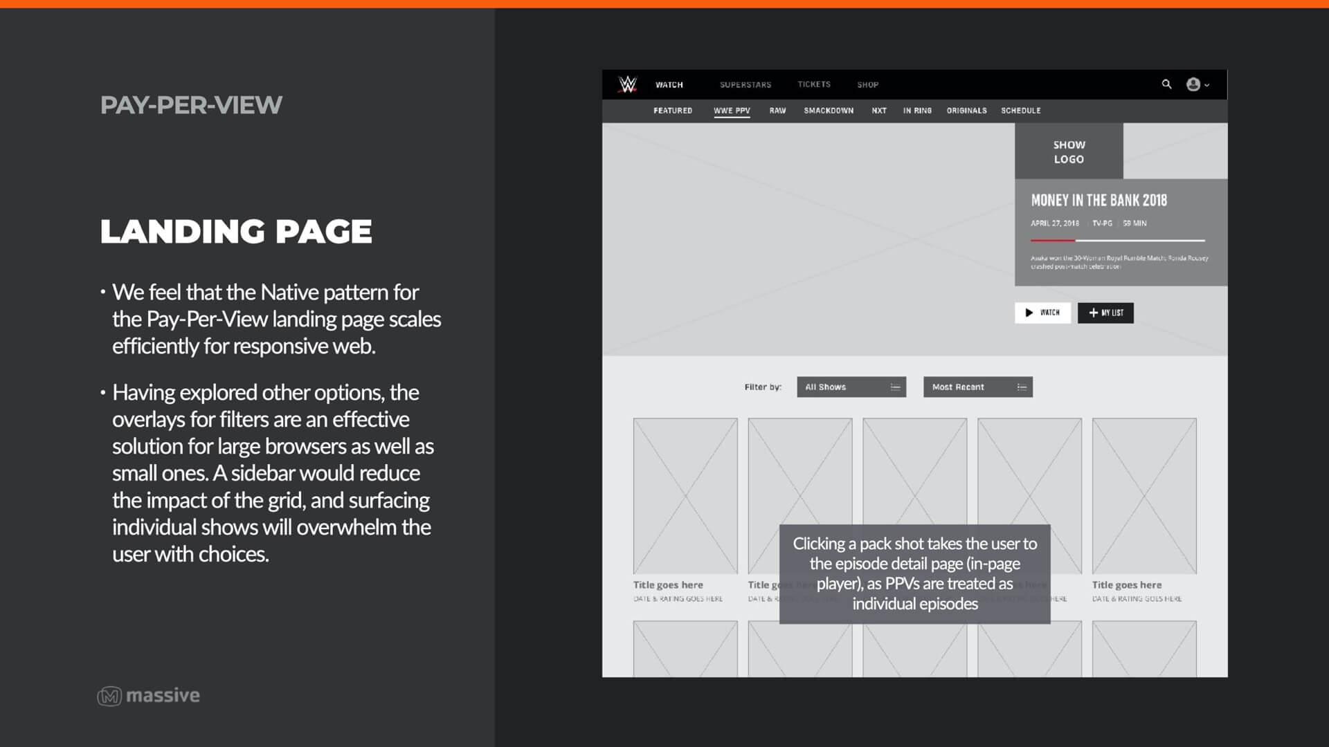
Each platform set (responsive web, native, TV) needed to have the information architecture mapped accordingly to account for interaction differences between the platforms. Responsive web also needed to consider extra functionality (shopping, tickets) from the adjacent WWE.com website.
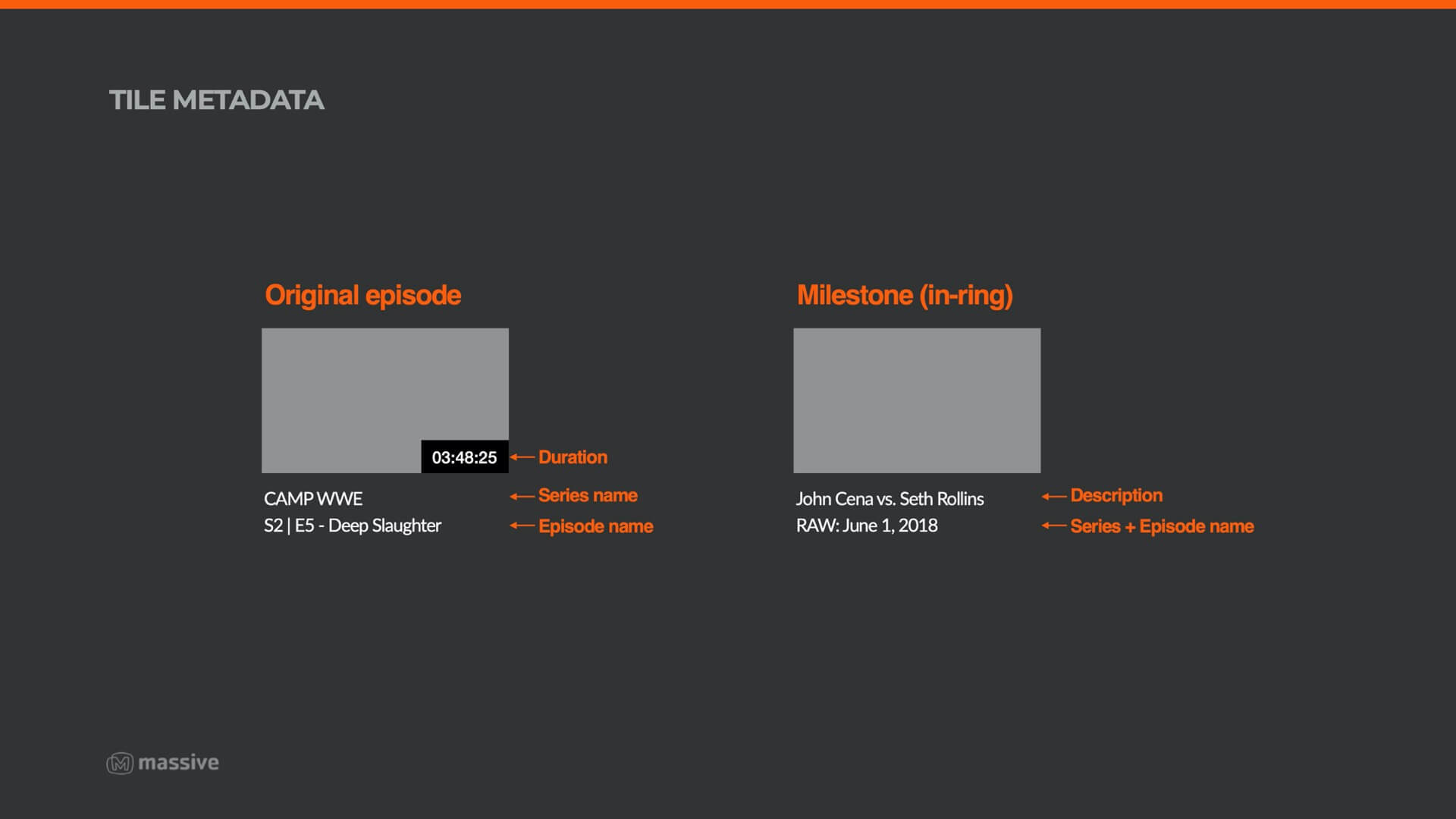
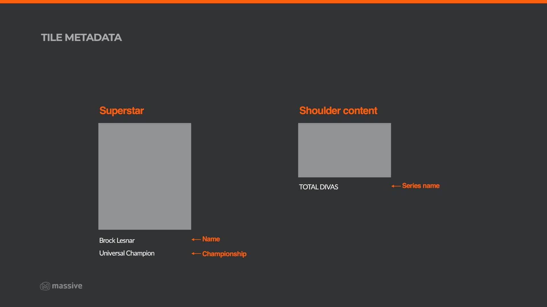
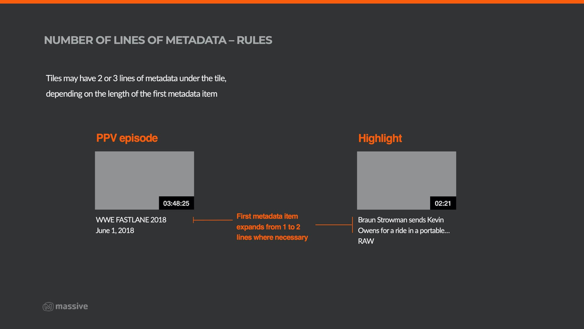
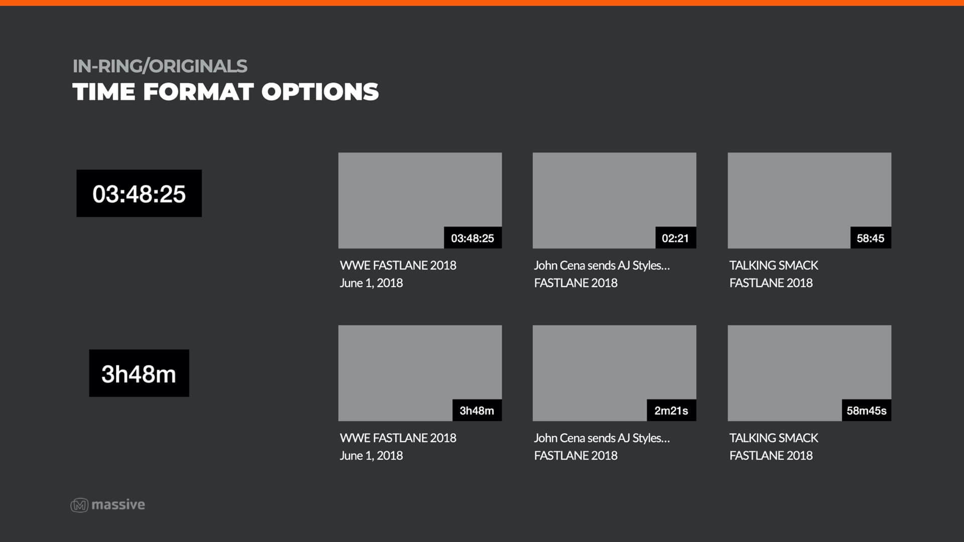
WWE has a vastly varied content library, with content spanning from 5-minute interviews to 5-hour live pay-per-view events. This required deep analysis in order to appropriately map and categorised all types of content for appropriate display.
Gap analysis & auditing WWE’s pre-prepared UX patterns
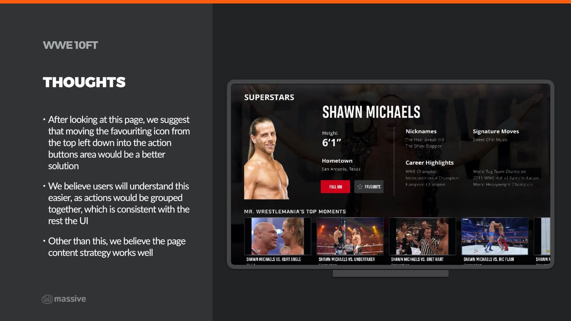
WWE came to the project very prepared, with a set of UX and visual designs that described their own vision for the project. We worked closely with WWE during the discovery phase, producing extensive documentation analysing WWE’s designs, and suggesting improvements for any confusing or inaccessible patterns we found.
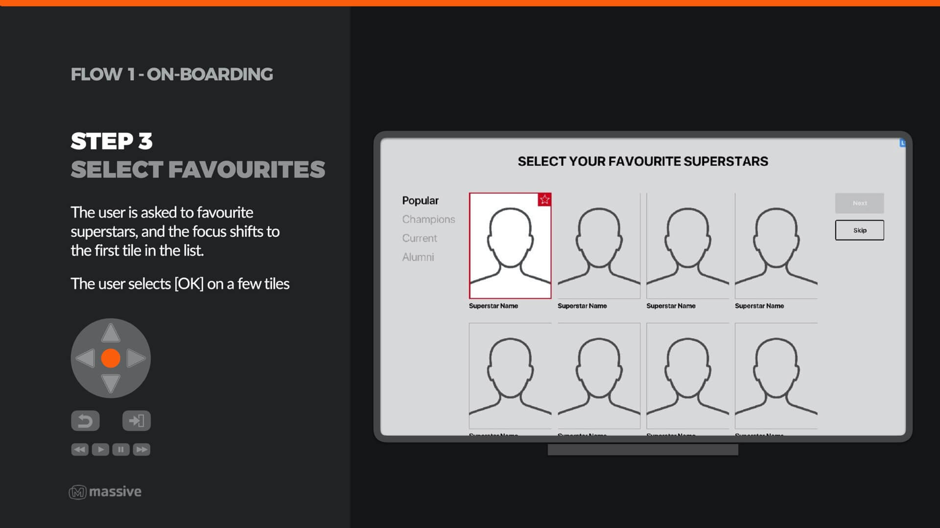
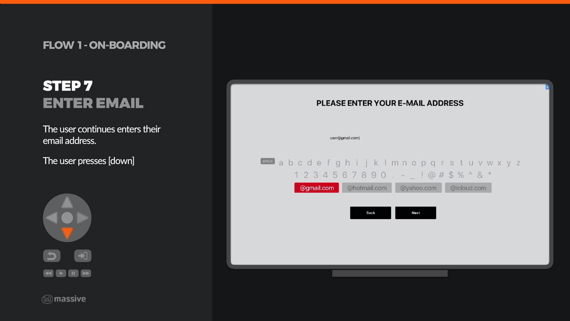
Creating a solid D-Pad navigation pattern for TV interfaces
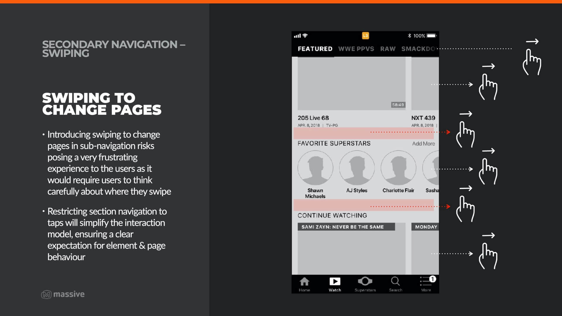
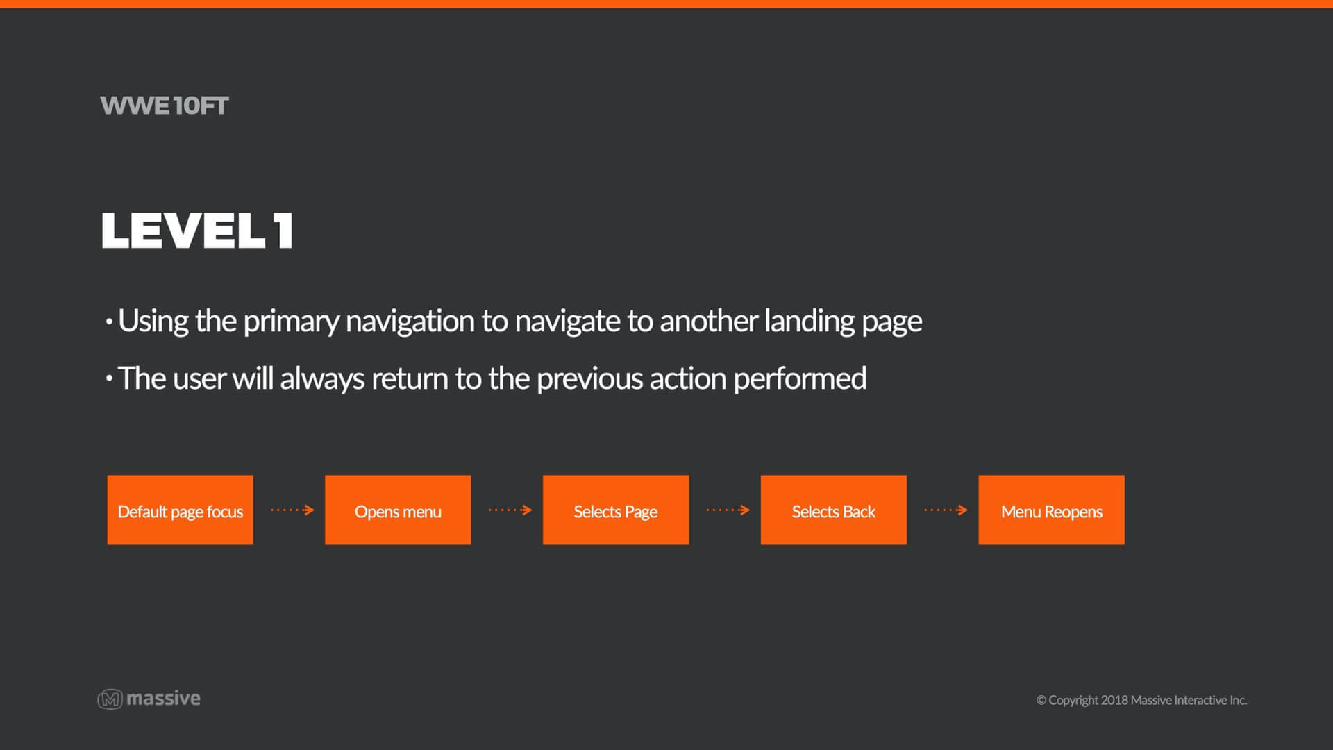
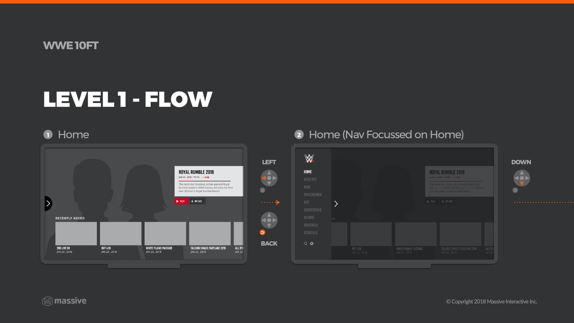
Smooth navigation with a D-pad is fundamental to good TV UX, so a lot of time and effort was invested into making sure the patterns across the service were appropriately tuned for d-pad. This mainly involved removing any diagonal navigation, lowering the amount of presses per flow to optimal level and ensuring every feature was navigable using just the four arrow keys, ‘OK’ and ‘Back’ on the remote.
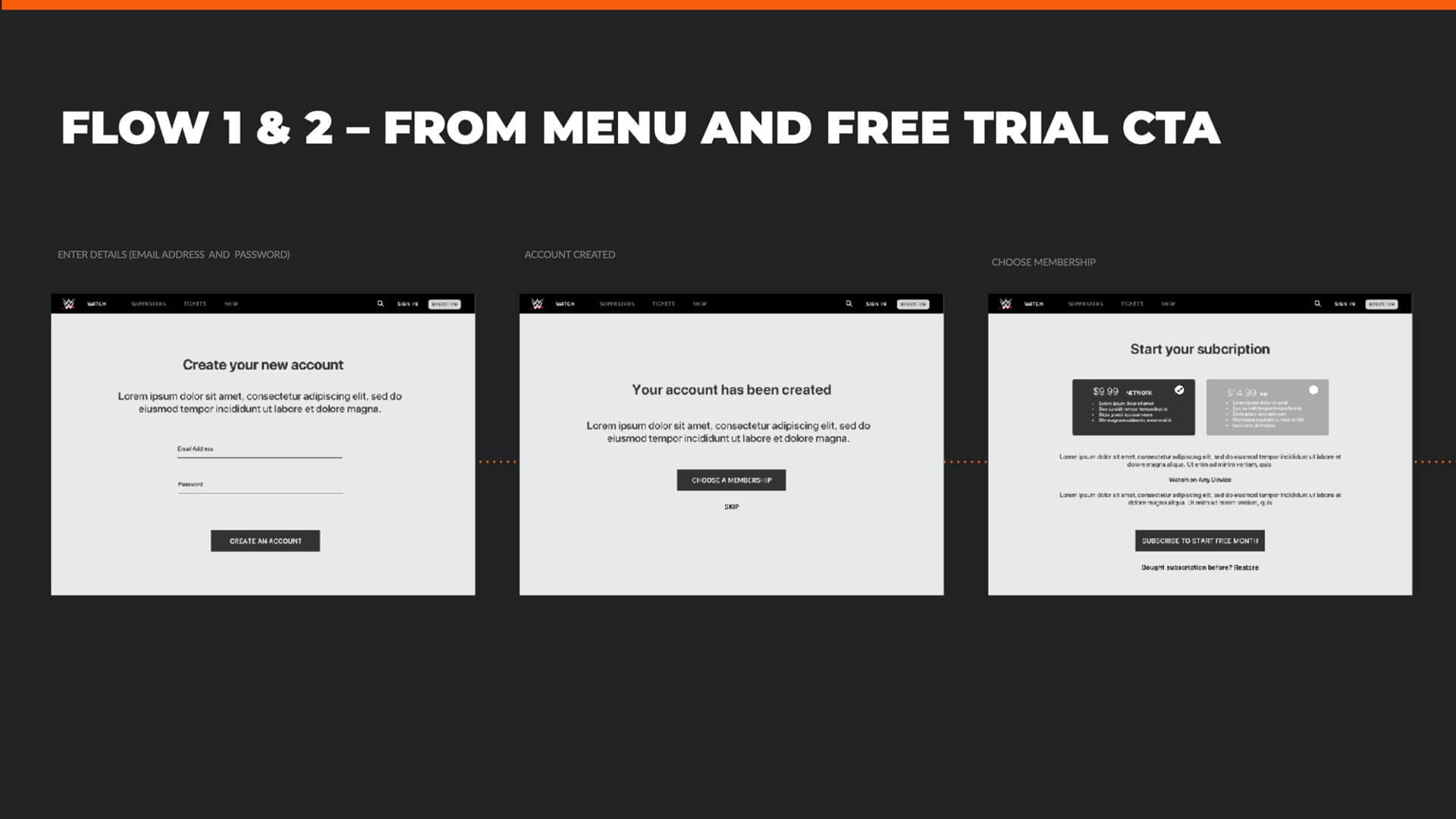
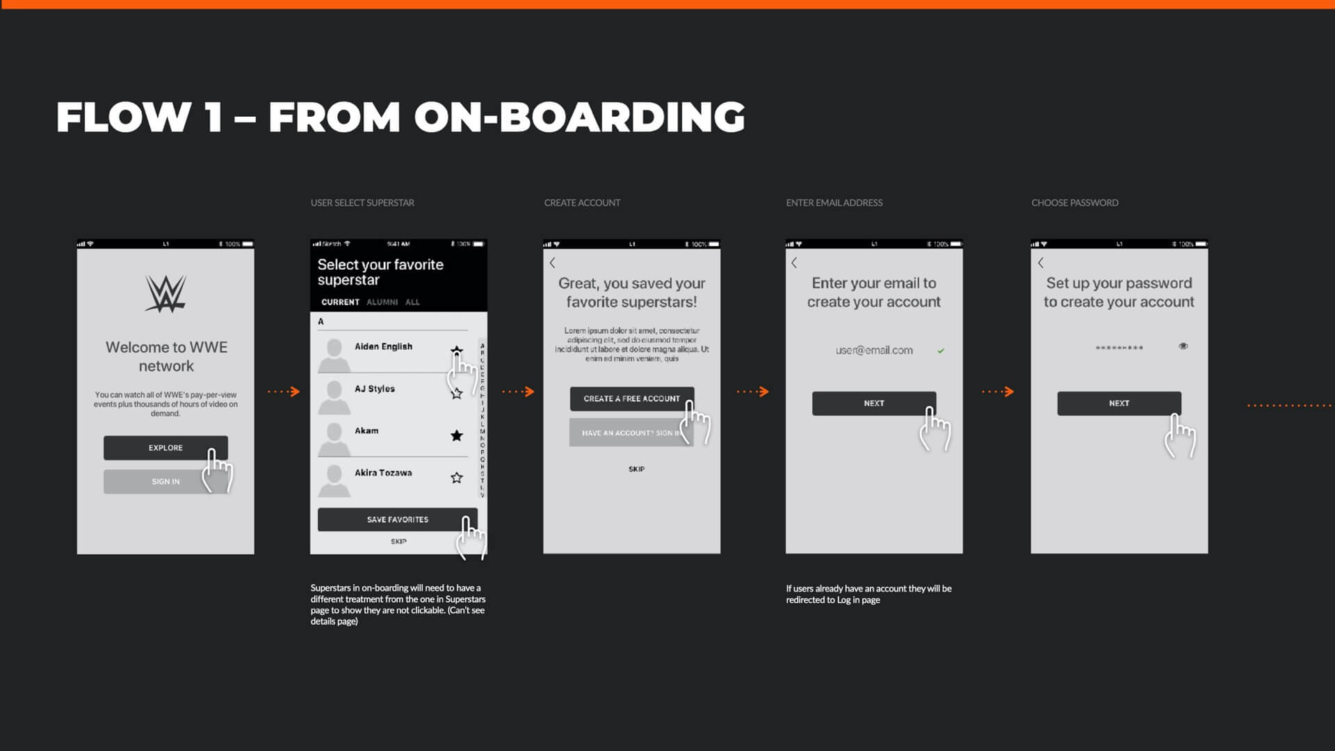
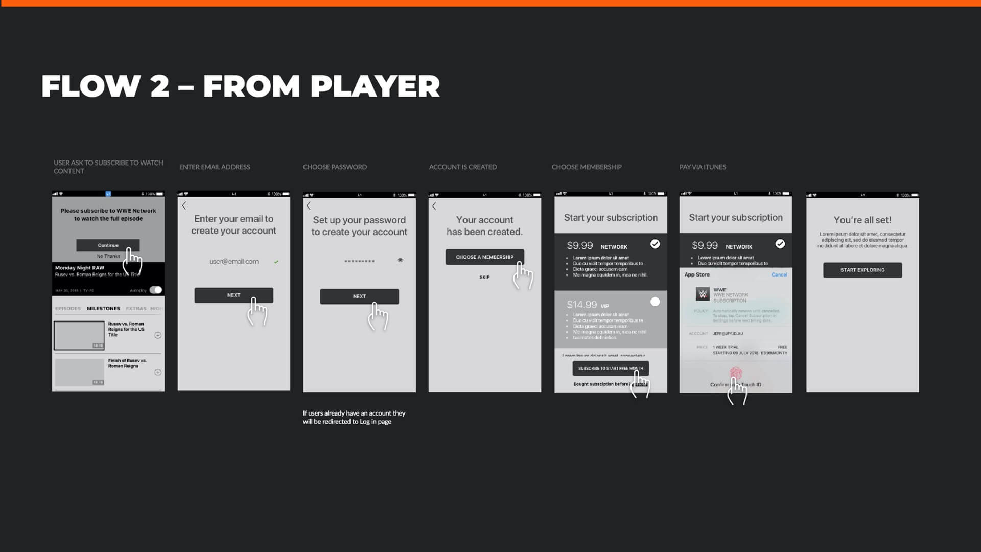
Defining the user experience for the registration flows
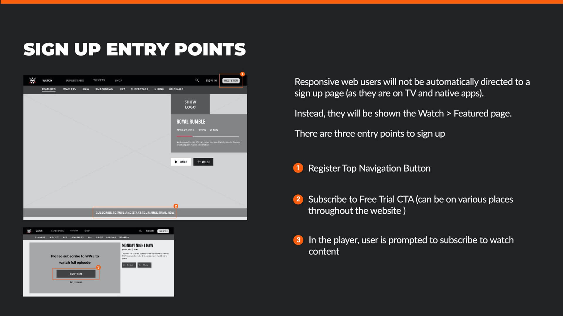
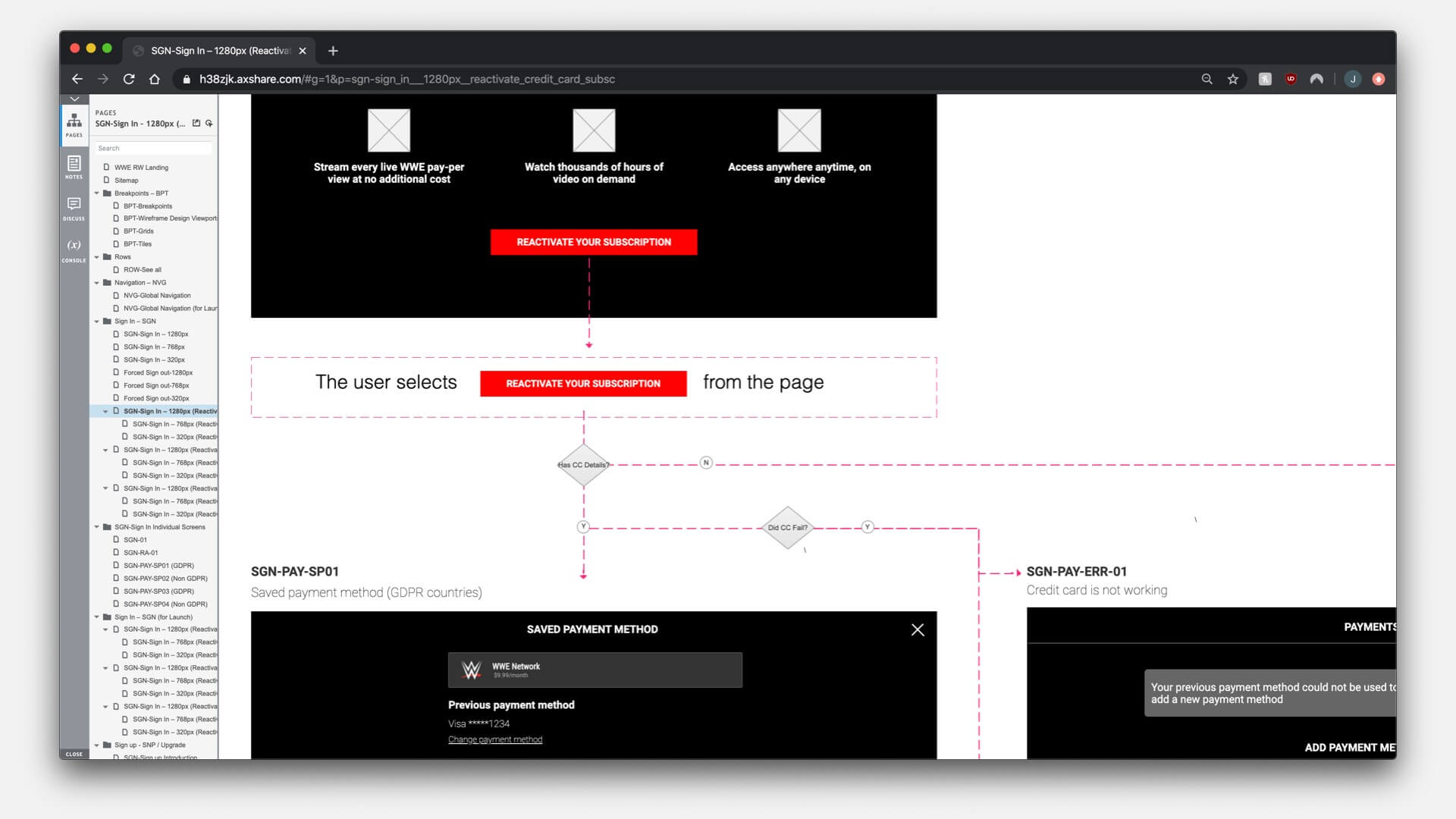
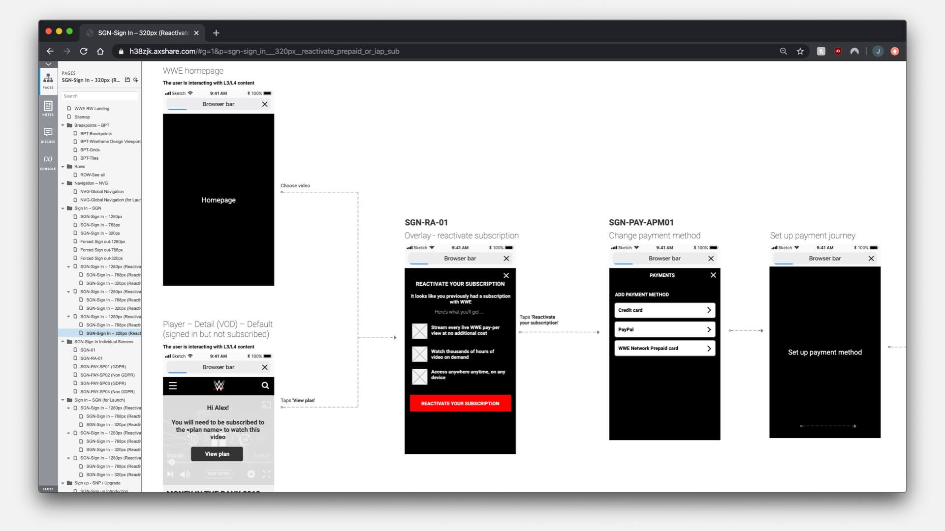
CONCEPT PHASE FLOWS: Each platform needed proof-of-concept flows created to prove out how users sign up to the service via every possible route. Client sign off on this allowed us to take this checkpoint through to detailed design and iron out any edge-cases and minor missing details.
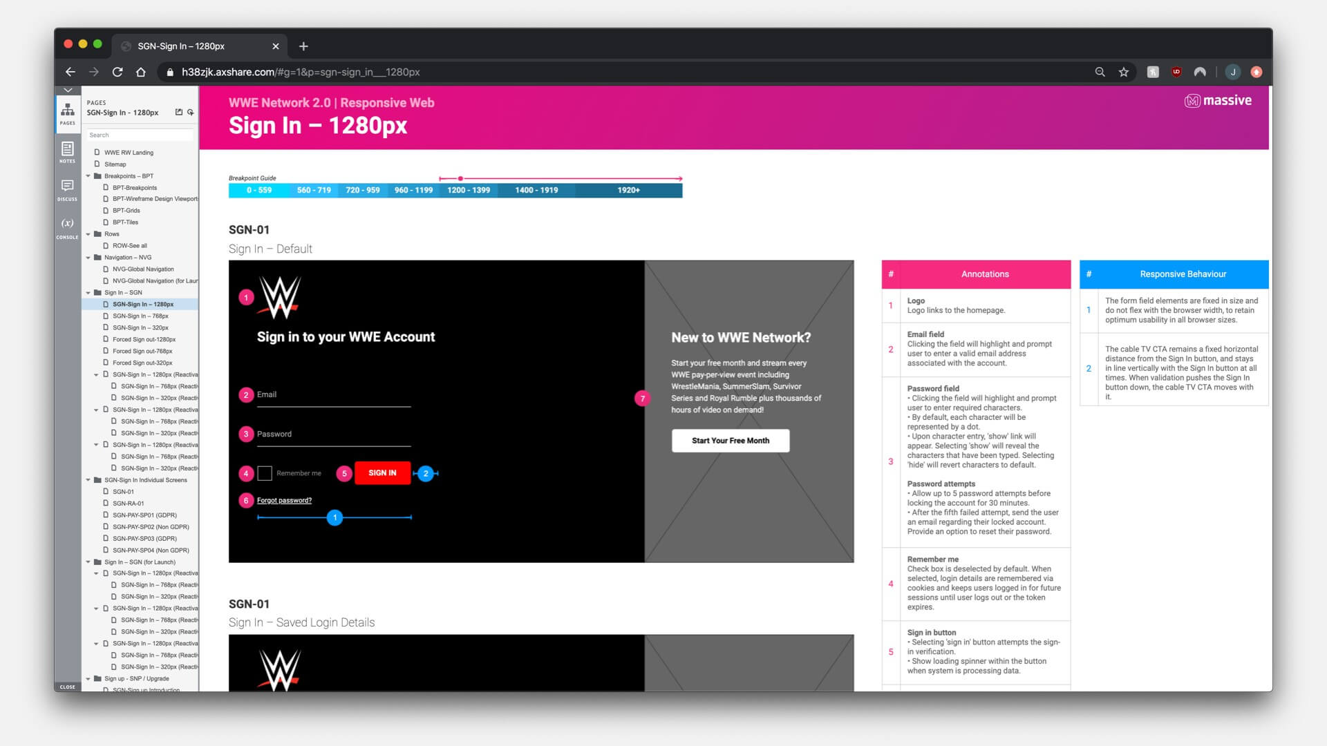
DETAILED DESIGN: I helped produce documentation for the sign in & register sections that were heavily detailed, and contained all of the necessary annotations to fully understand the user flow as a client, and build them as a developer.
Producing detailed visual designs
Visual design production began based upon the wireframes and each section was taken in turn. There was one UI designer per platform, plus me as the lead, directing the team and filling in to help create designs where needed.
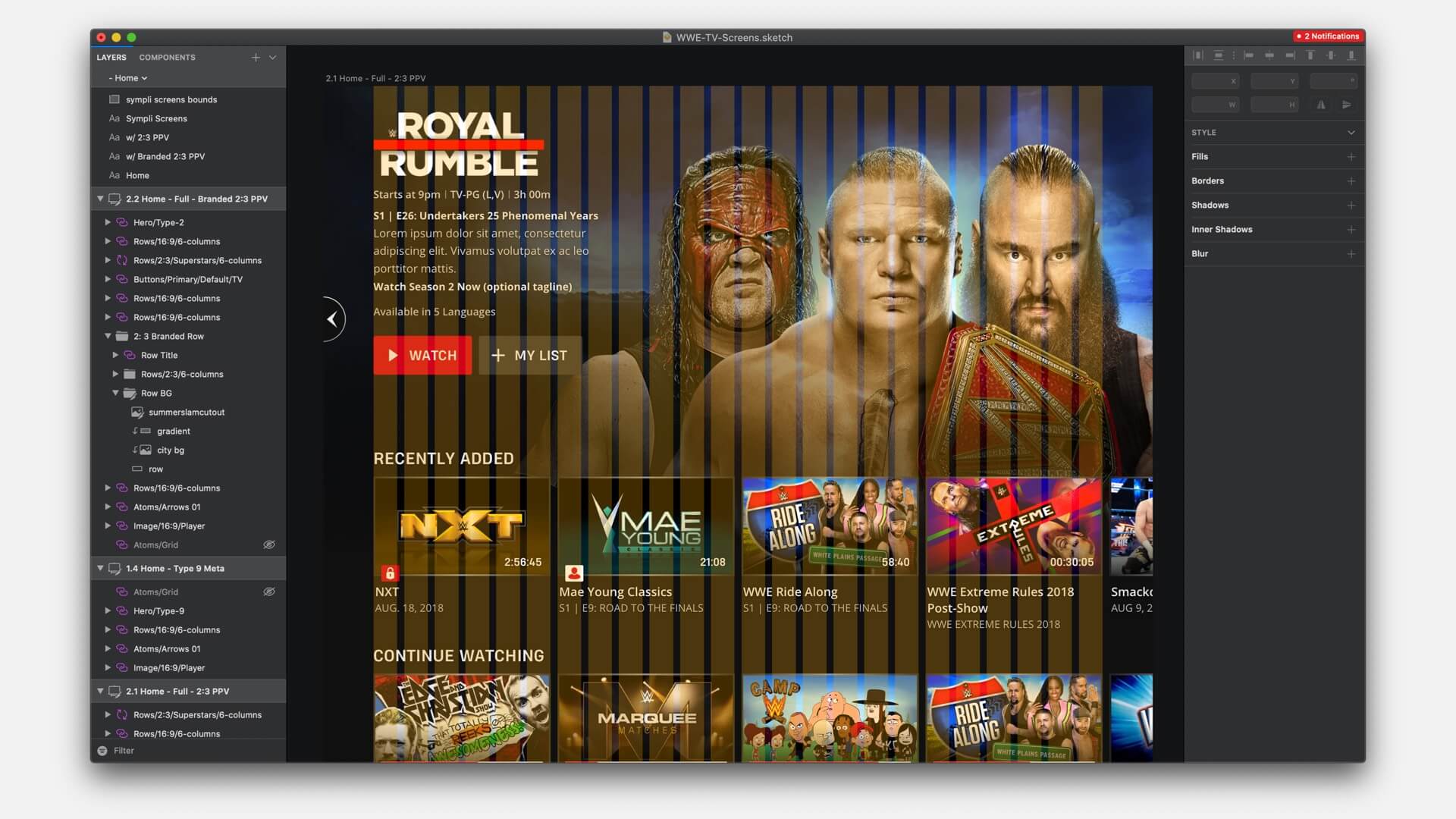
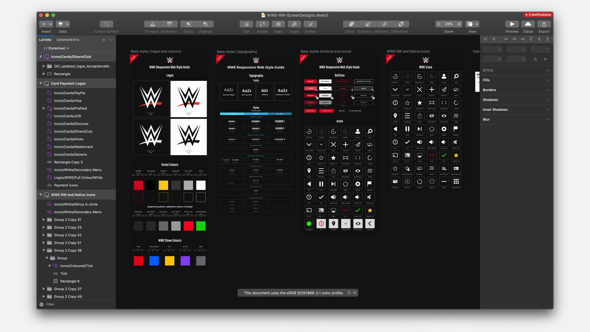
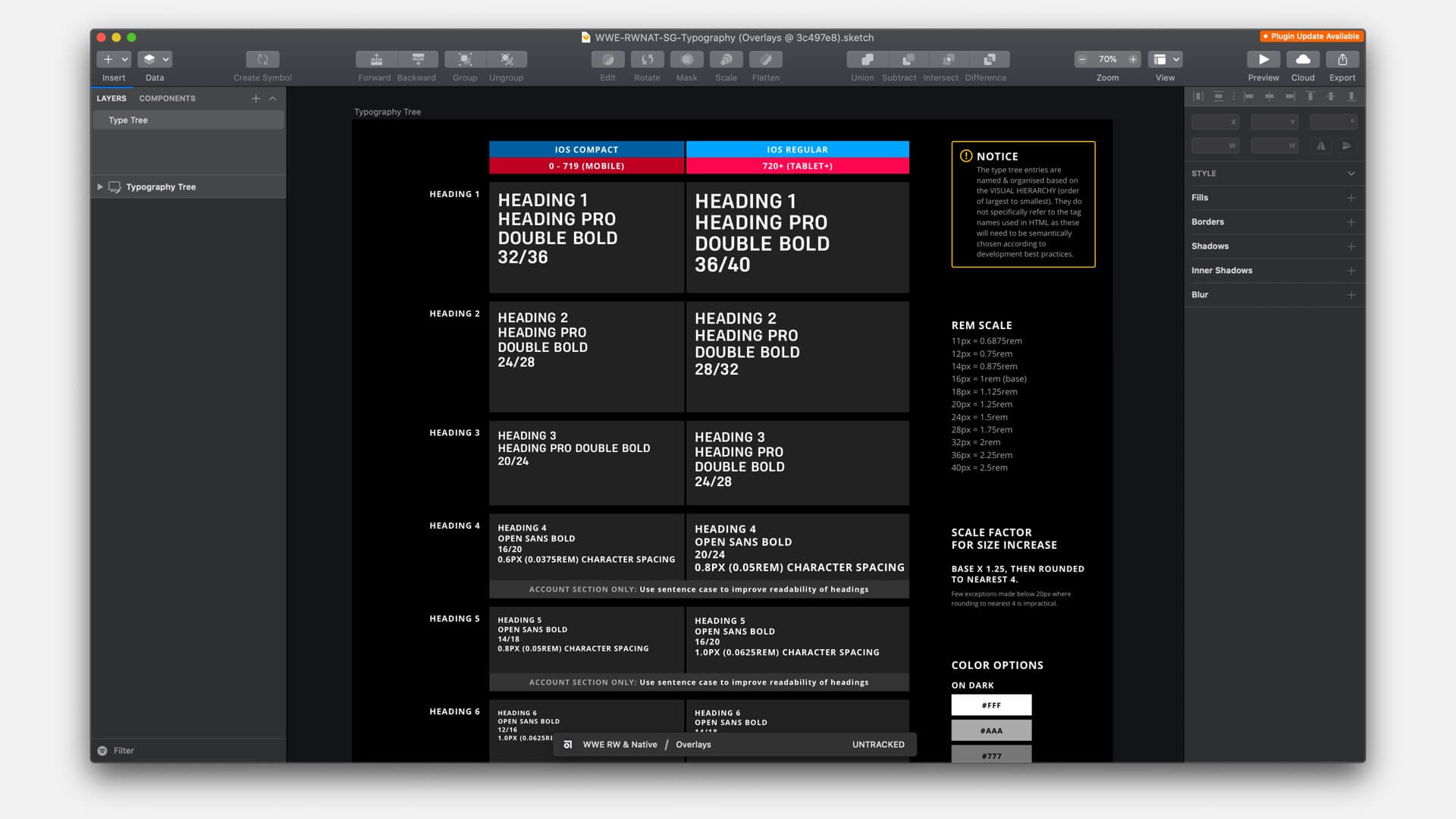
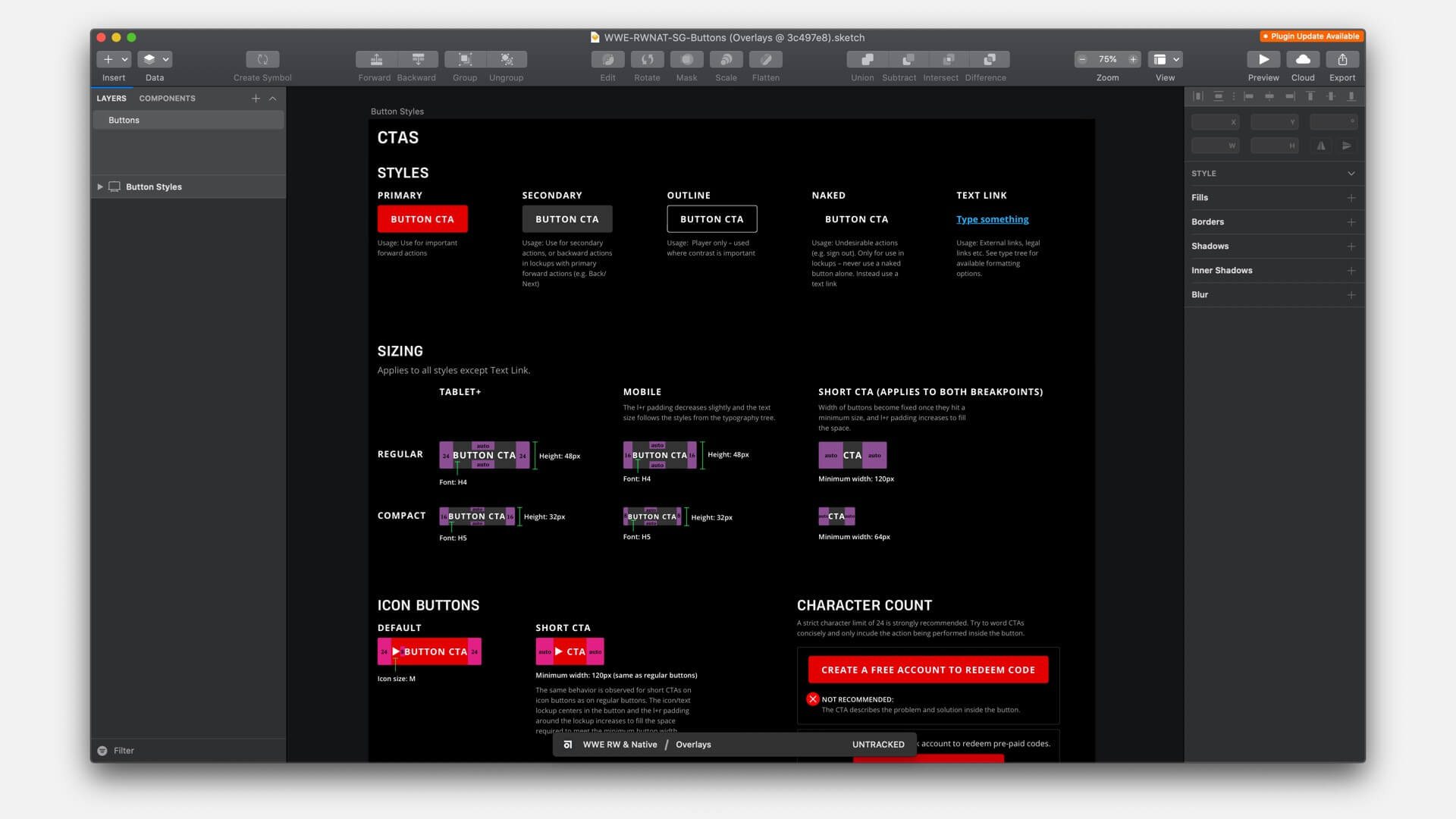
A grid system was produced for each platform to allow for easy & consistent construction of visual components. Style guide documentation was also produced to economise on design where possible.
Above: a video demonstration of the TV player functionality and visual design.
Making the visual interface accessible
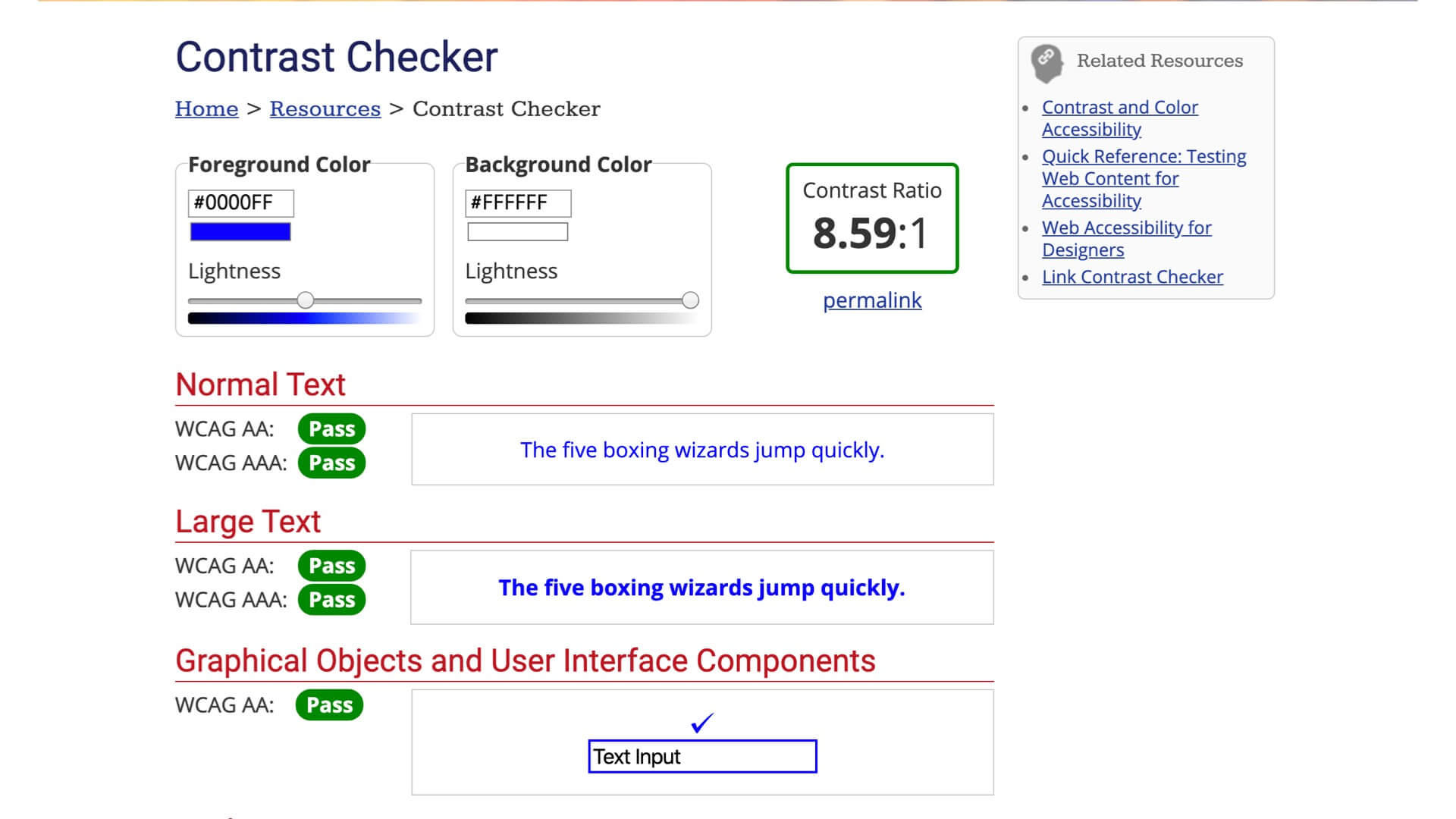
We followed the guidelines for WCAG 2.0 AA as a minimum throughout the project. For contrast checking we used webaim.org (shown above). Care was given to every component during detailed design to ensure it was accessible both in visual appearance and functionality.
Post-launch: building a future-proof design system
After the completion of the launch phase we took stock of the designs and files, and realised we were going to need a better design system to handle the scale of the project going forward.
In close collaboration with the client, I developed a new design system that enables very fast creation of screen designs. Drag-and-drop-like capabilities within Sketch were made possible by putting a heavy focus on component-based design and technical documentation. This also had the added benefit of making UI designers on the project more likely to catch and account for edge-cases when designing.

The new system was built upon:
Sketch
For creation of designs, with a large emphasis placed on maintaining reusable symbols. More focus is placed on style guides and technical documentation over static screen mockups.
Abstract
Enabling cross-team collaboration, and reliable versioning amongst a growning design team across multiple regions.
Zeplin
For automatic markup of designs and downloading of assets through the Zeplin interface, largely automating the developer handover process.
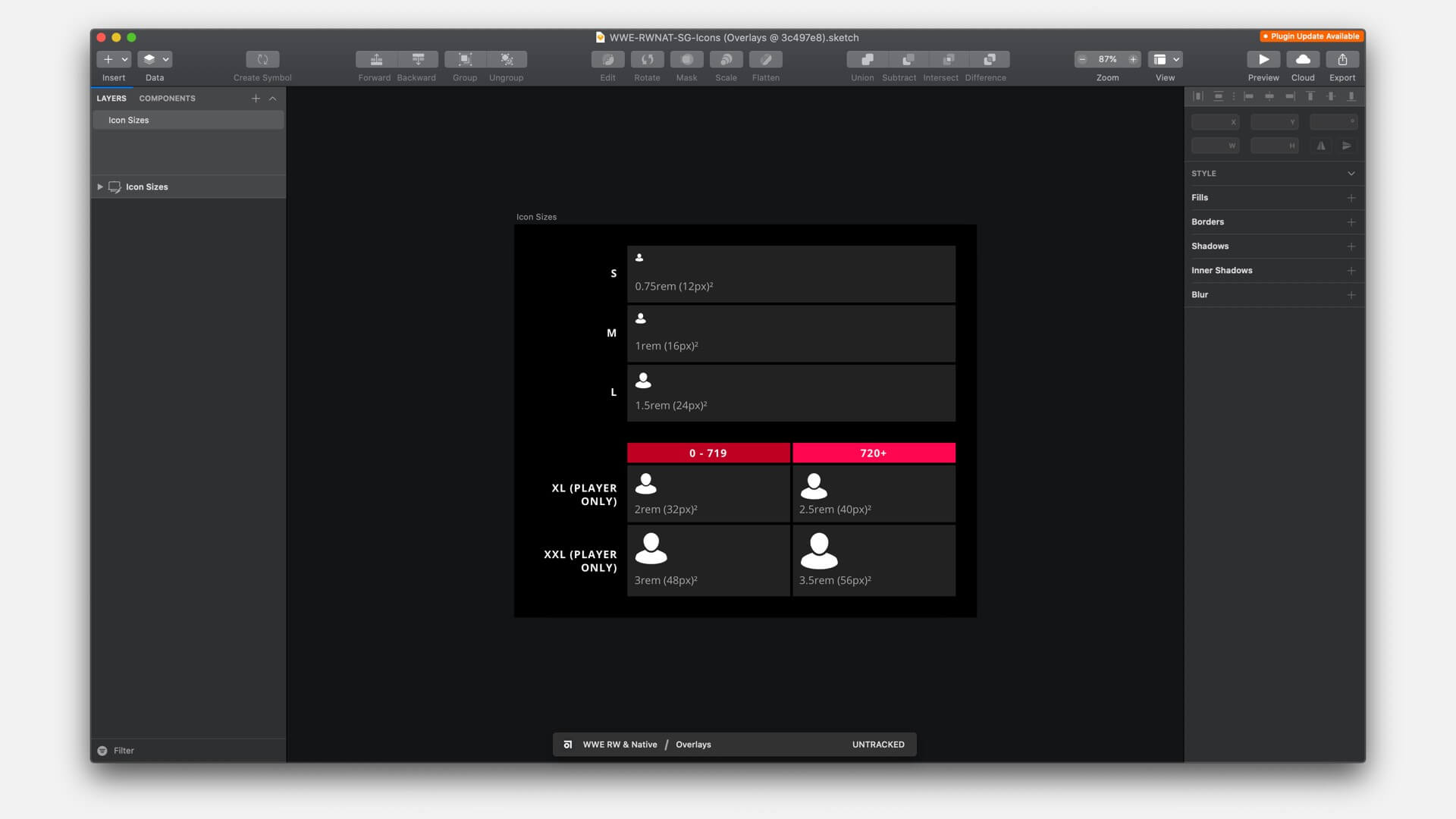
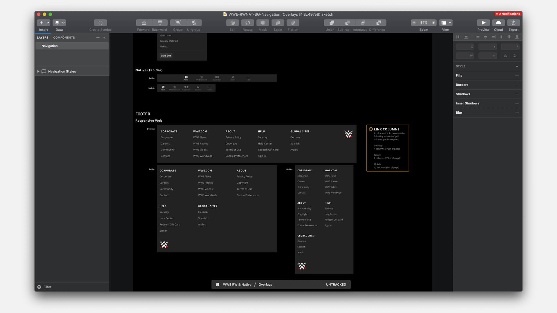
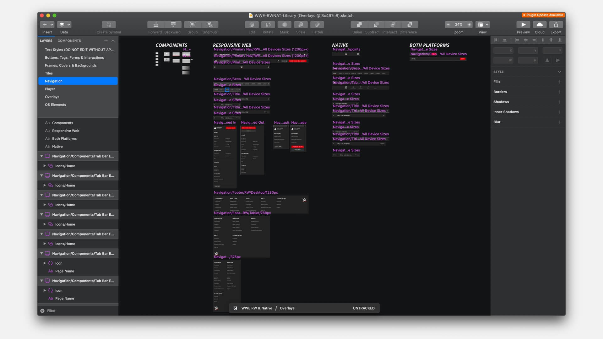
Above: Excerpts from the overhauled style guides and symbol libraries.
