Final product samples
Results and project info
Key facts & figures
Outcomes
- Modular skinning approach enabled one design to work across 6 different brands and reduced screen design requirements by approx. 95%.
- Close collaboration with the developers improved our design handover process dramatically, cutting development revision time by at least 50%.
- Clients were incredibly happy with how economically we were able to deliver the design across all of their airlines in such a short timeframe.
- Customer-facing LEVEL airlines in-flight portal won an APEX best in-flight entertainment innovation award.
Timescale
8 weeks from initial brief to design completion
Tools
Sketch, Axure, JIRA, Confluence, Slack, Sympli, Keynote
Created while working for:
Deltatre (formerly known as Massive Interactive)
The team
Project Lead
Jeff Young
UX Lead
Jonathan Lees
UI Lead
Jon Addison
UX Designers
Belen Tahir
Jon Addison (concept phase)
UI Designers
Adam Gordon
Josh Whitwell
Project overview
Brief
IAG needed a crew service application that would enable flight attendants to receive and take payment for orders placed using the IFE system.
Business goals & project challenges
Business goals
Reduce time taken for flight attendants to serve food and drink
Allow flight attendants to see orders coming in via the IFE in real time
Internally identified challenges
Very small design & development budget, and tight timeline
App would need to be used by staff from 6 different airlines
Flight attendants have busy and stressful jobs, so the app would need to be as intuitive and accessible as possible
My role in the project
Lead the UI design direction and get client buy-in throughout the design phases.
Platforms
iOS
iPhone 8 Plus
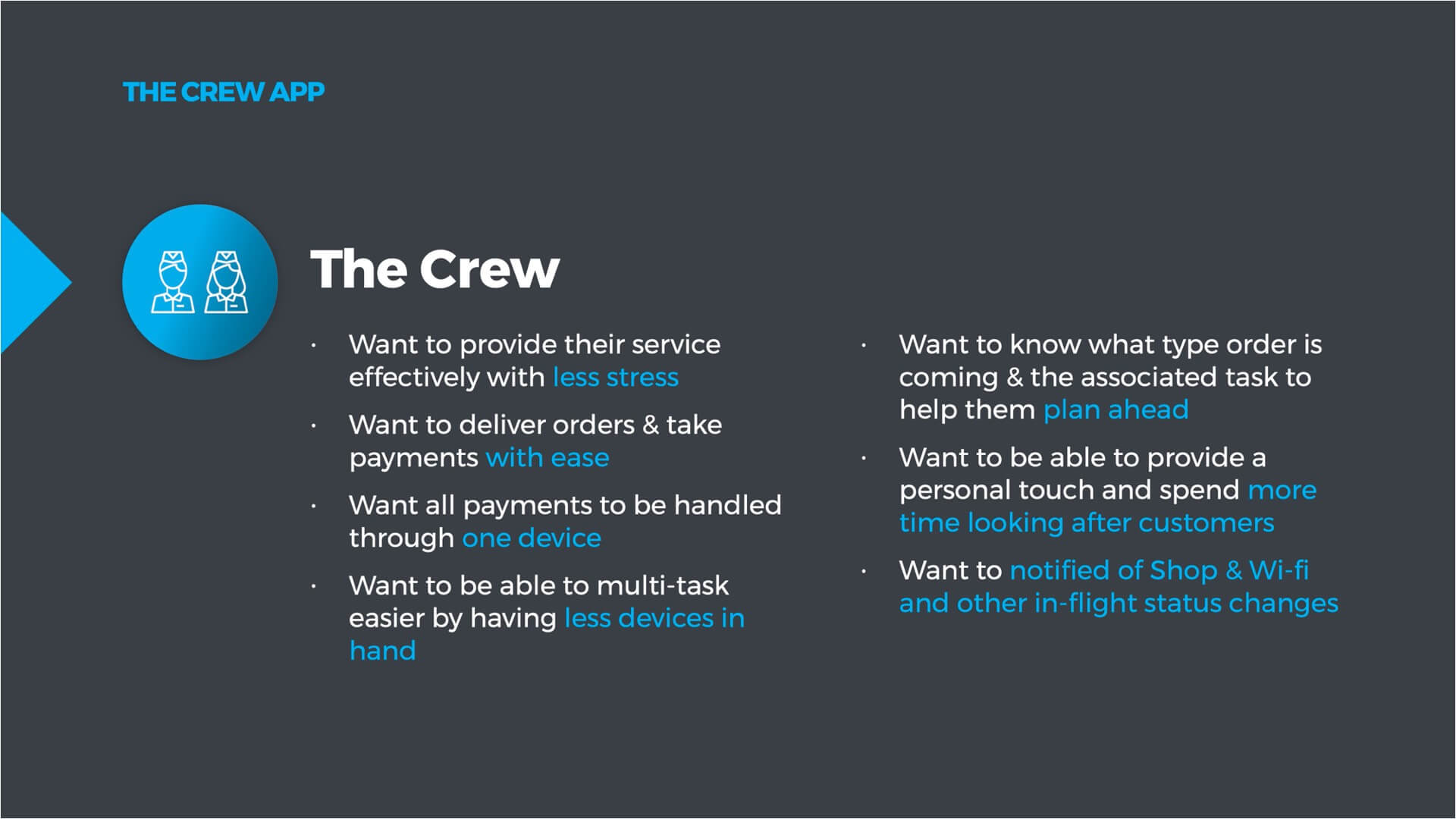
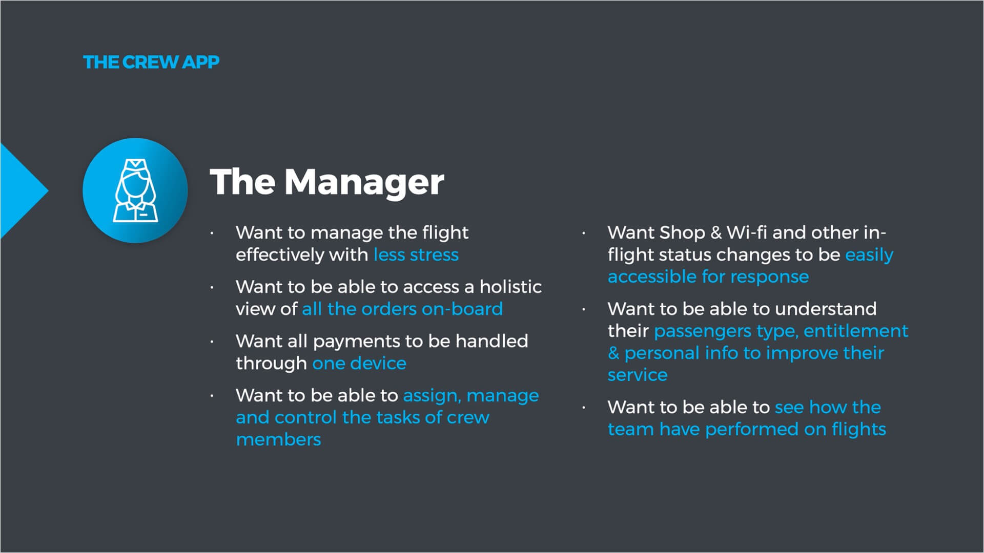
Understanding the needs of the users
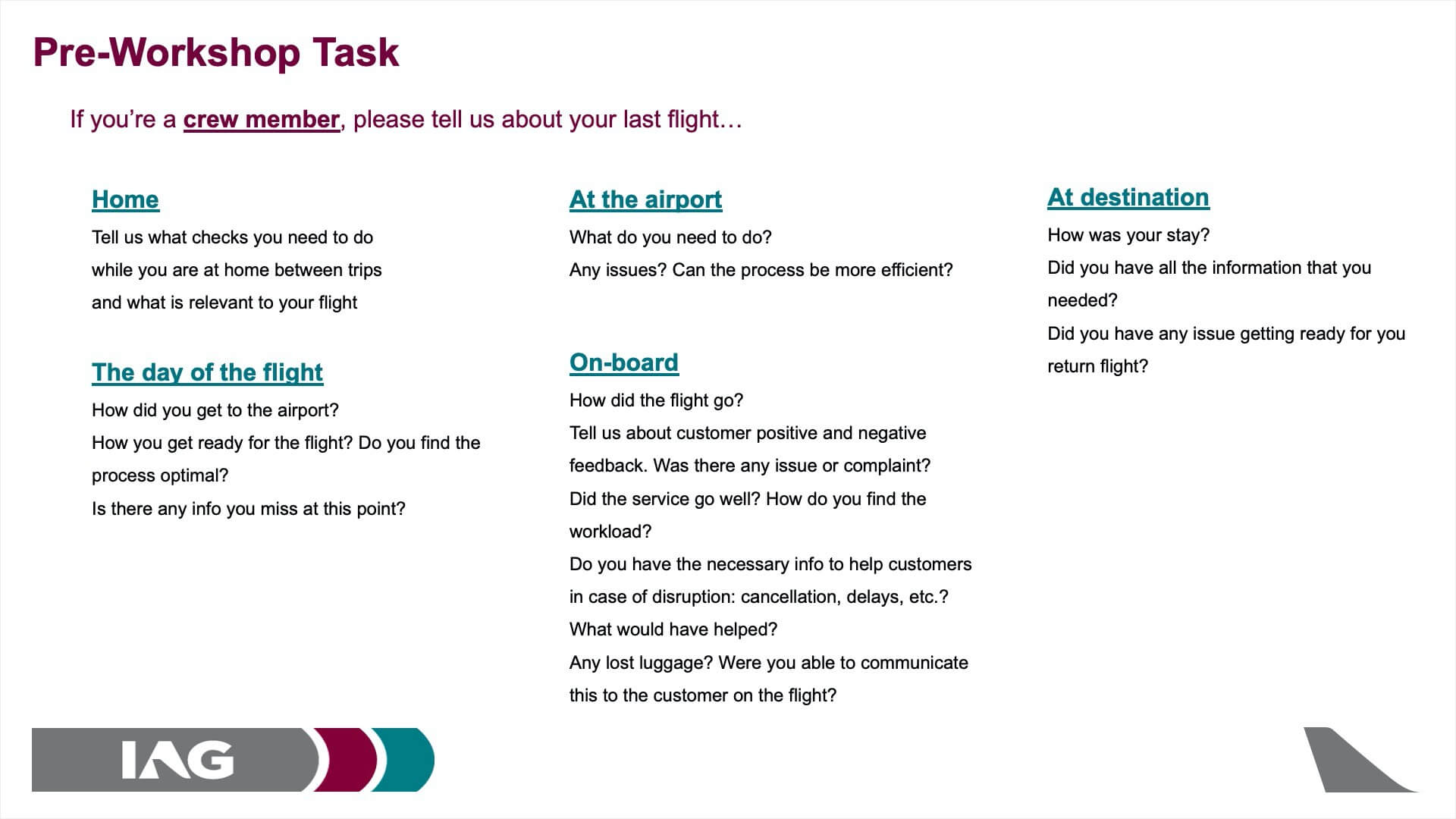
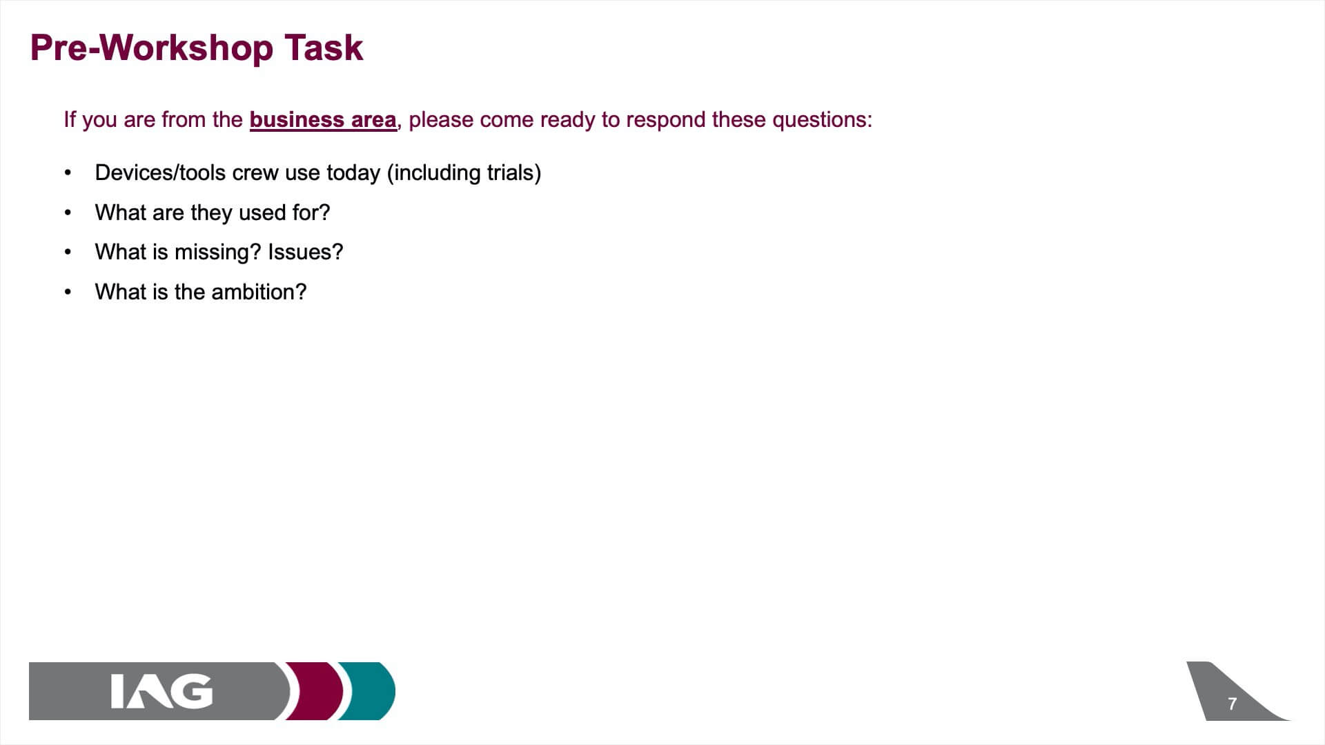
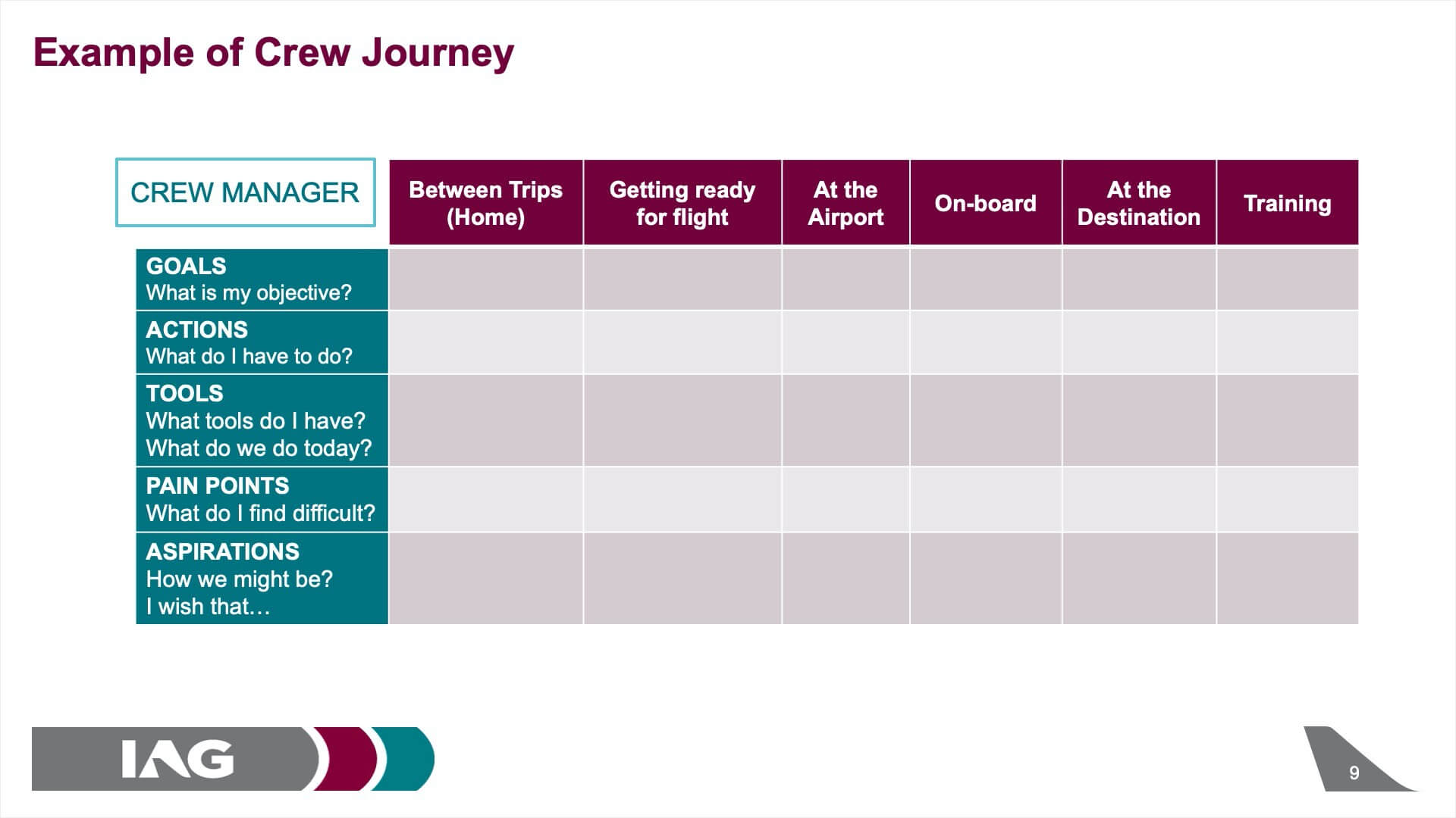
A workshop was arranged by IAG shortly after we were briefed on the project. Crew members and managers were present at the workshop to have a discovery session on pain points in the current system. The slides were prepared beforehand by IAG and we assisted in guiding the workshop and ensuring we extracted non-biased responses from the staff.
Processing the information from the brief and workshop
From the brief and workshop we extracted the following design considerations:
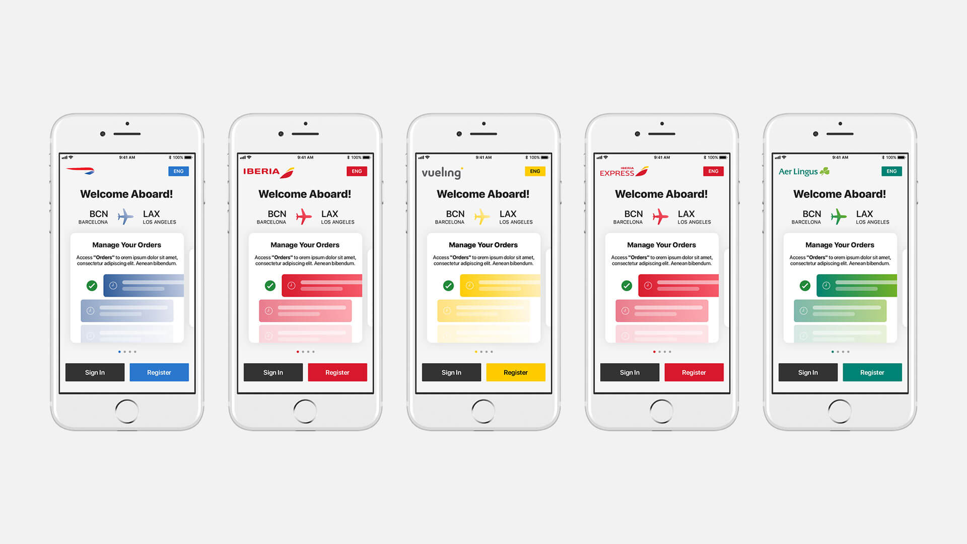
- The crew app would need to be created for use by the 6 different airlines under the IAG umbrella
- The crew were extremely busy people with lots of stress and distractions to worry about throughout their workday
- The timeline and budget for production of the app were tight, and there would not be time for a lot of design exploration (we had one shot to get it right!)
Creating a concept document
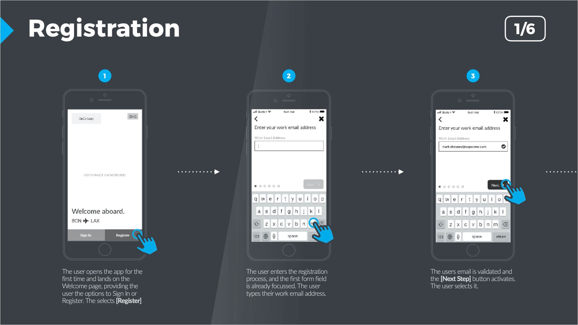
Over the next 2-week sprint we worked as a team to create a concept document detailing the vision for the experience. During this concept period I helped the UX team with:
- Defining the user needs
- Creating the registration flows/wireframes
- Creating the order management concept flow
Handling the detailed layout during the UX process

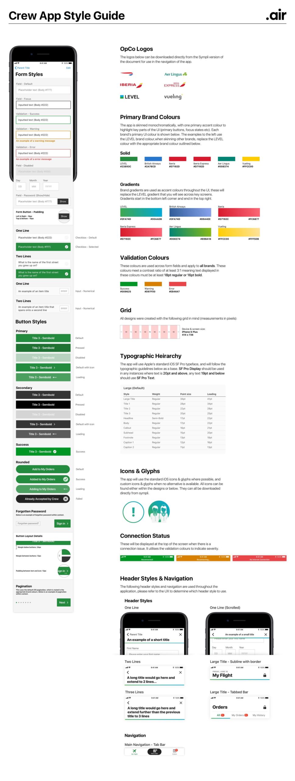
During the UX phase, I consulted with the UX team to help create proportionally accurate wireframes that follow minimum font size rules, a realistic typography tree, and accessible interactive areas. We also chose at this stage to use out of the box iOS components such as header bars as much as we could. These choices meant foregoing a bit of creative freedom to ensure better stability for the visual team.
Given that we knew we were working with a single screen resolution (iPhone 8 Plus) this was an extremely valuable exercise, as it avoided the traditional bugbear of ‘the fold’ when translating the wireframes into visuals. It also meant we could largely focus on skinning each component in a templatable fashion to handle the multiple-brand issue.
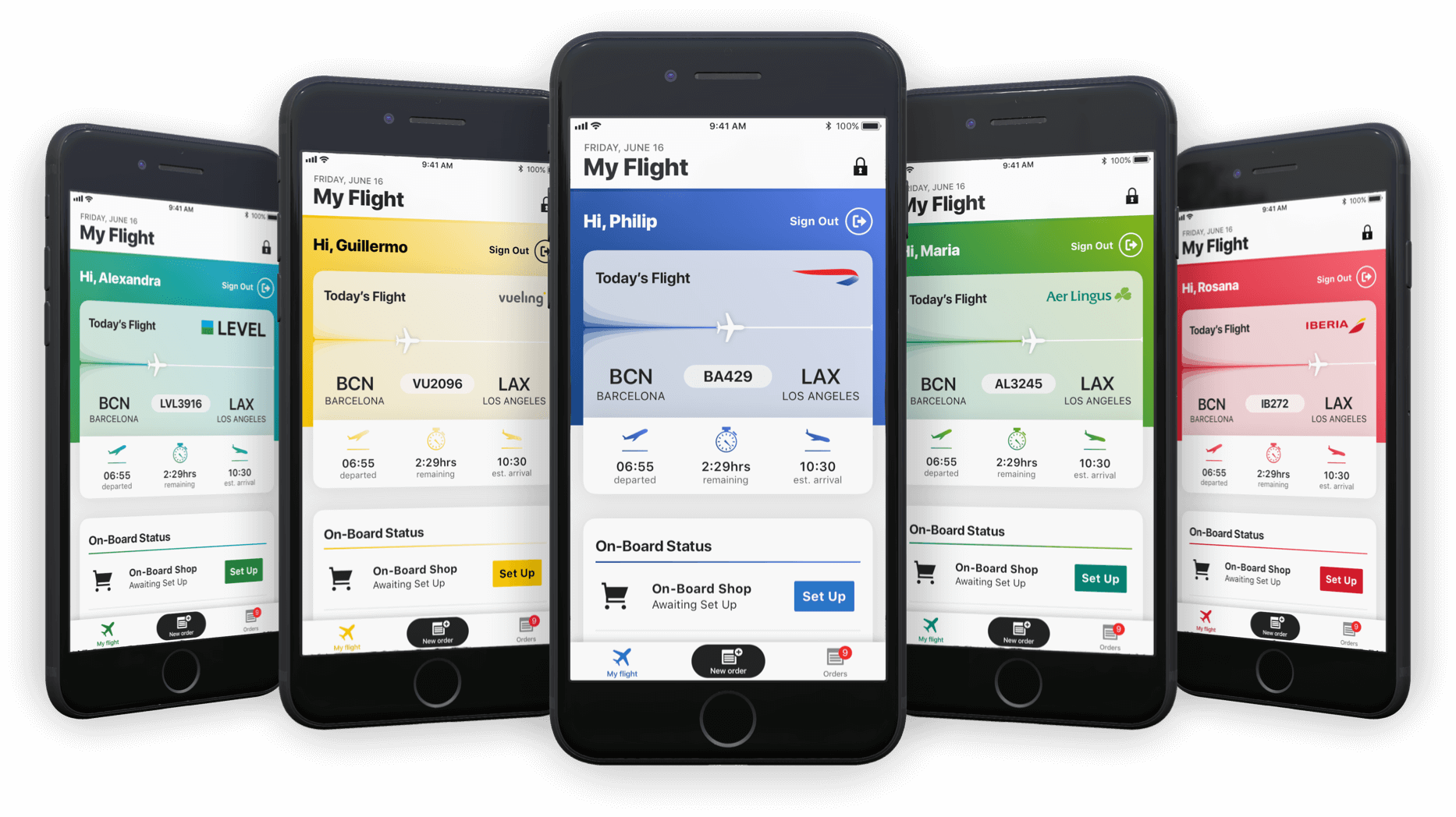
Branding six apps simultaneously – deciding the approach
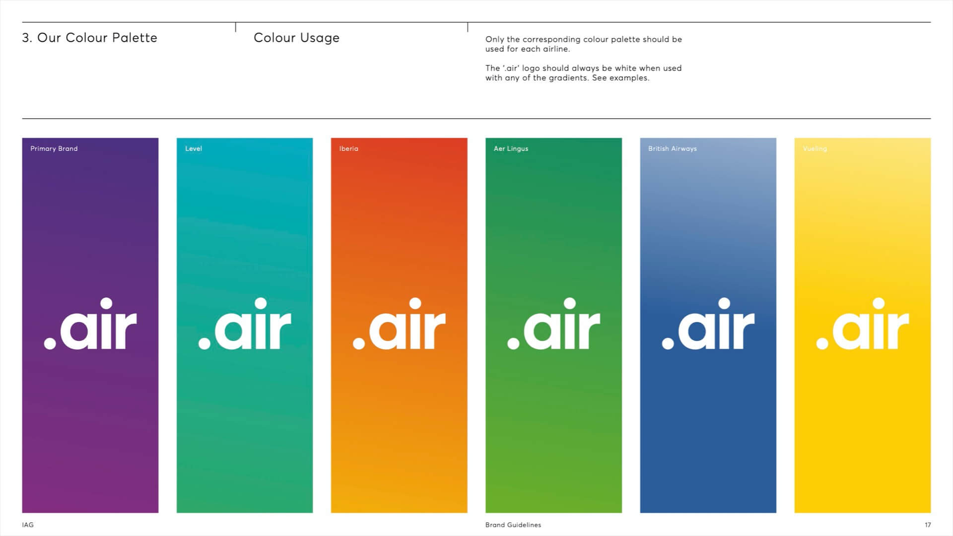
During the briefing, IAG had shown us their desire to bring in a digital brand called ‘.air’ that would tie the airlines’ connected digital experiences together.
This brand lent itself perfectly to the need to create a highly functional and reskinnable UI, so we pitched the idea to build the basis of the UI on the .air brand, with the airline brand’s primary colour being used to both brand the service and focus the user on points of interest. We produced a few test visuals to validate the concept with IAG before proceeding.
Producing detailed visual designs
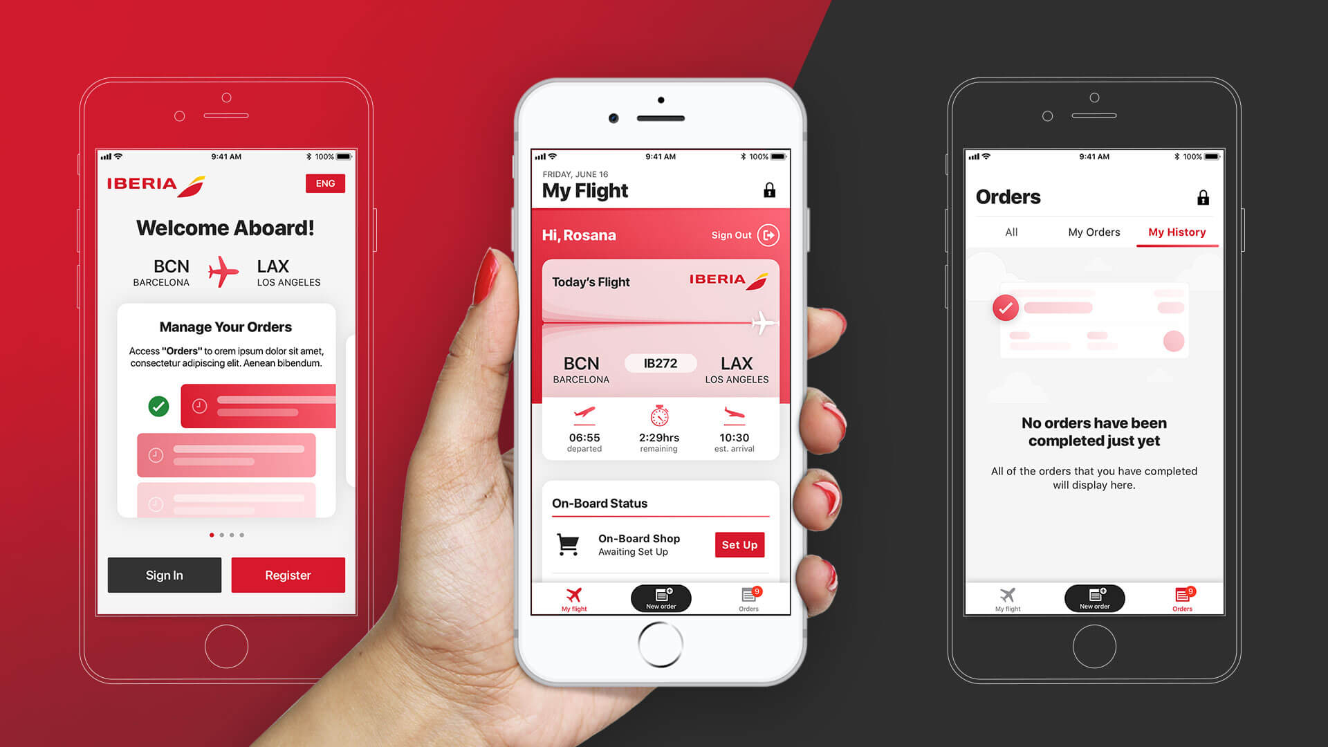
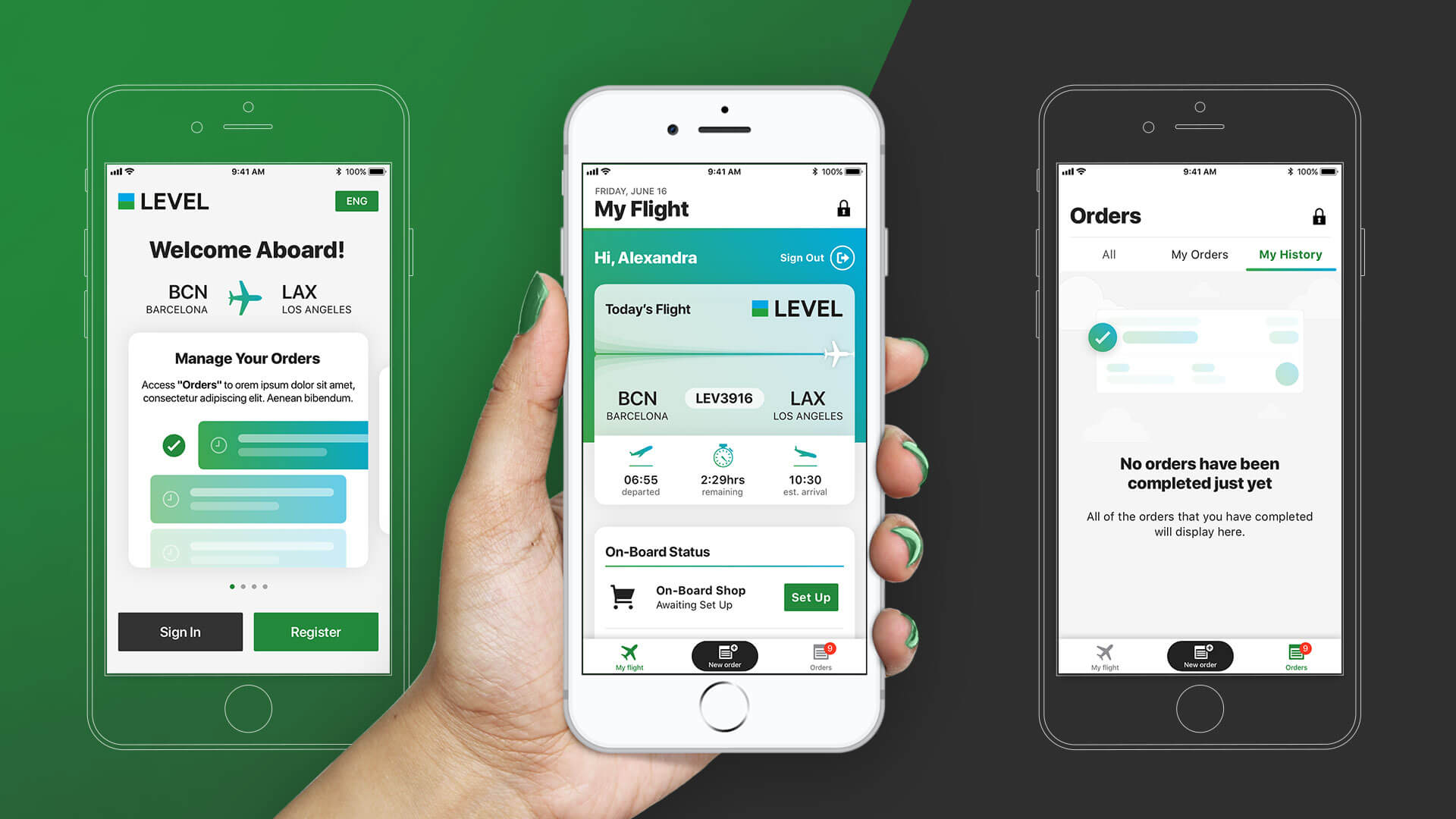
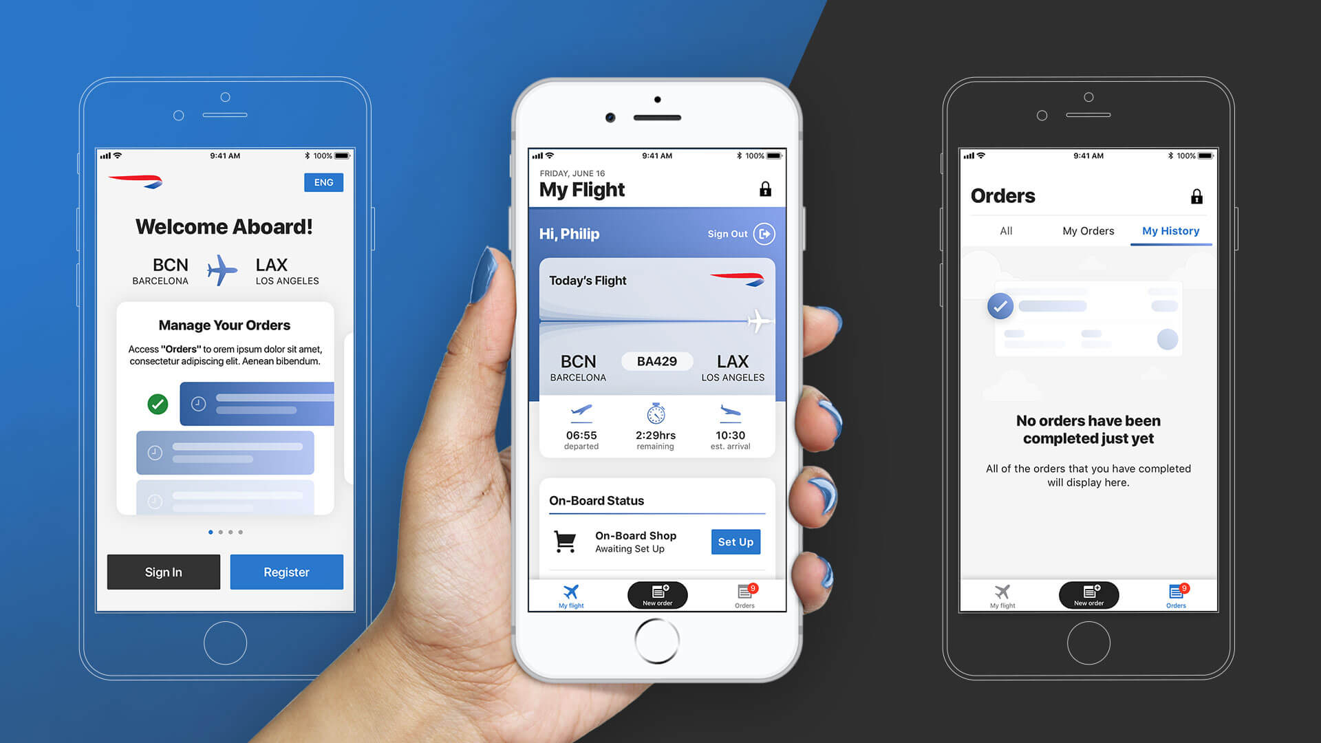
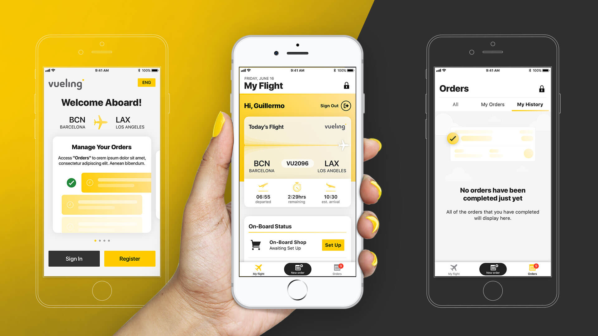
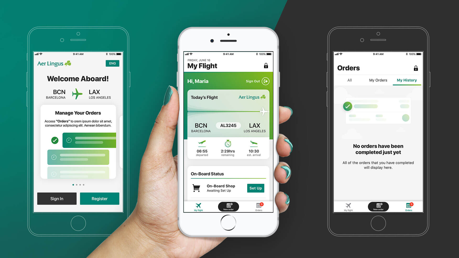
IAG accepted the proposal, so we set to work creating the detailed designs to hand over to development. As LEVEL would be the first airline to launch the crew app, we used their branding as the example skin for the screen designs.
We wanted to make sure the app still had plenty of the airline’s brand colour, so we worked with our neighbouring developers to find a way to skin icons and graphic elements to each brand. They told us that as long as long as we provided neat vector PDFs for the graphics and gave them the respective colour codes, they’d be able to recolour the icons within Xcode.
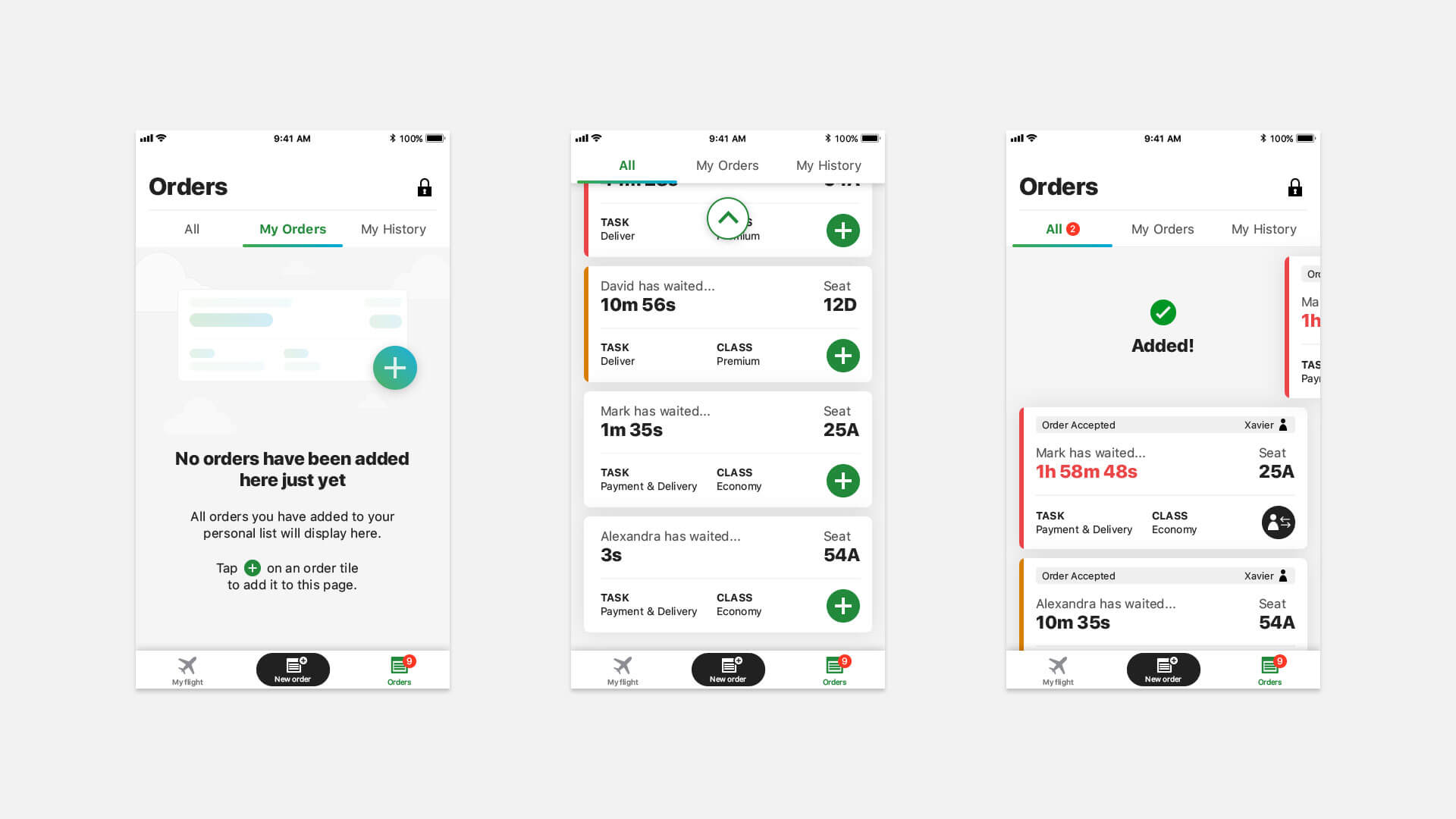
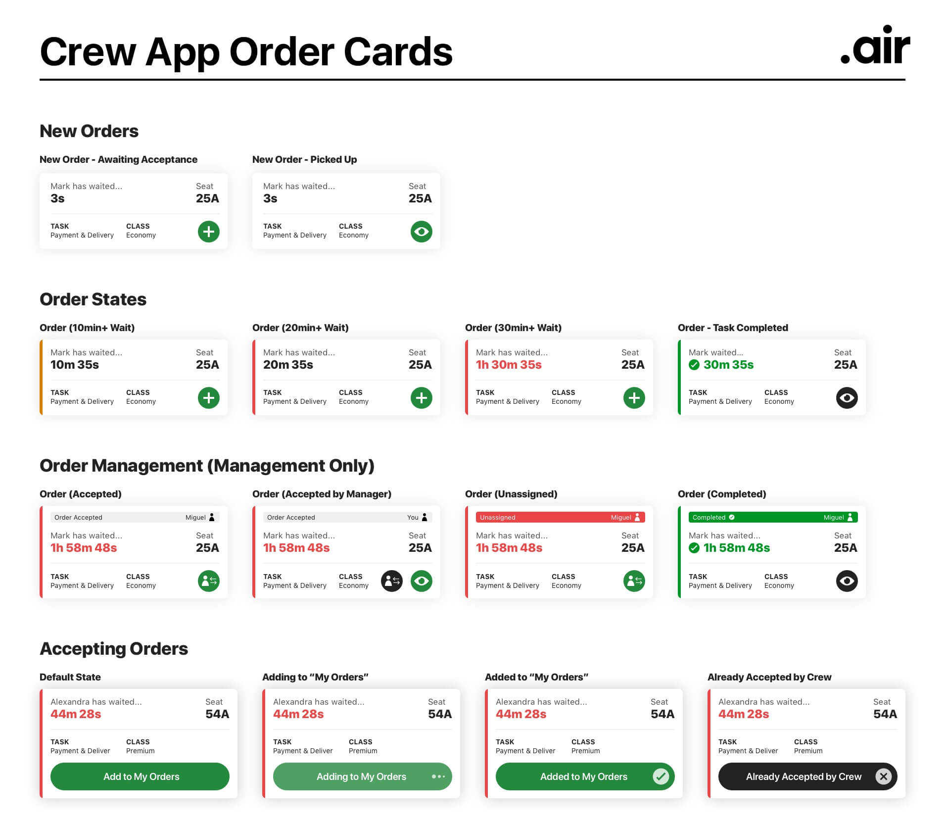
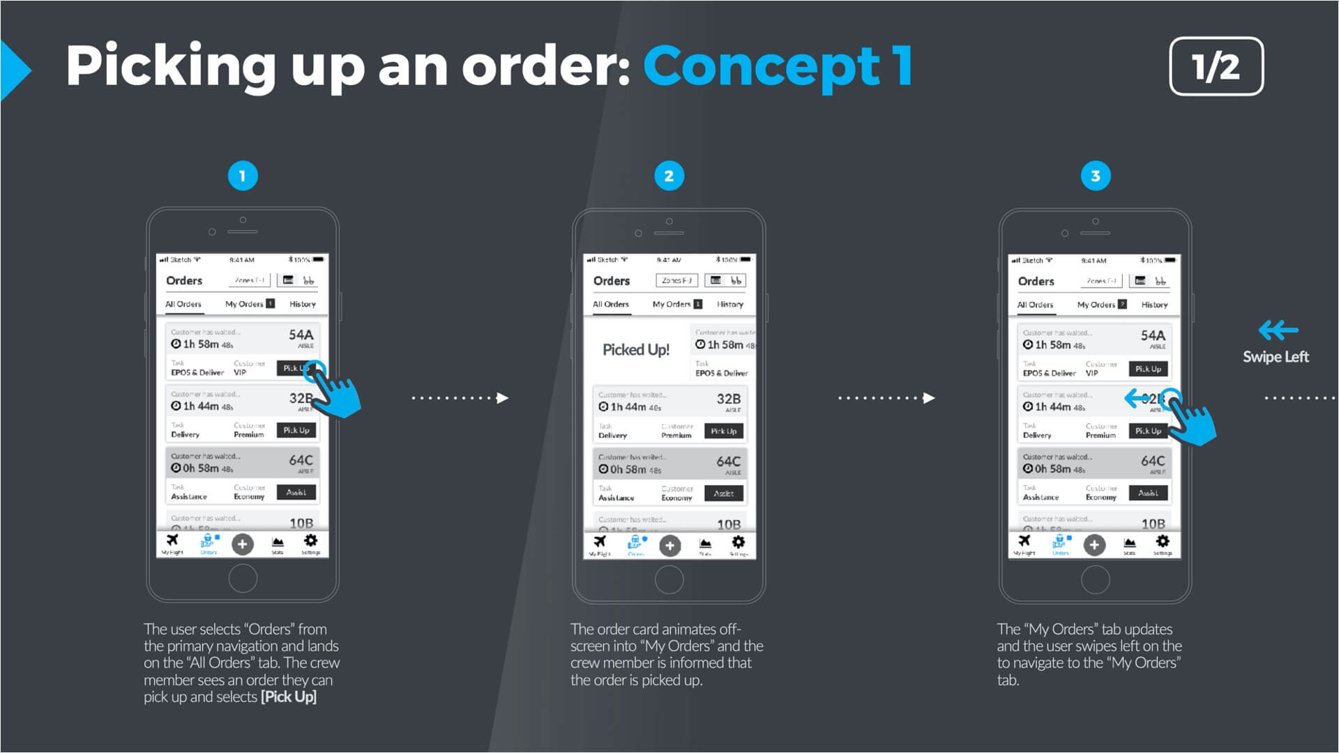
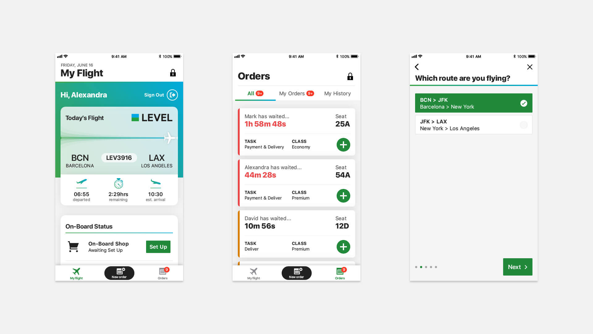
The order cards are what crew use to pick up onboard customer purchases for fulfilment. Given the importance of these cards, we were keen to prioritise the important functions so that the information would be digestible at a quick glance. To do this we added the following design elements:
- The wait timer was made extra large
- The ‘pick up order’ button was the only brand colour usage on the card
- The orders had colour codes on the left edge to quickly indicate that a customer had been waiting too long
Making onboarding visual with skinnable illustrations
We knew that a functional UI could risk appearing overly flat and bland, so we wanted to inject some graphics and illustrations into the interface. The issue we were aware of with this, though, was that these would have to be skinned in the same way as other coloured elements in the app.
With previous learnings from developers during the icon discussions in mind, we chose to adopt a similar approach for illustrations. Using just the brand gradient and leveraging opacities, we were able to create illustrations with a feeling a depth, while keeping them easily skinnable by developers with just a few lines of code.
Creating the style guides
Along with a main style guide, we produced a chart to show all of the permutations of order cards in one place. This would make life much easier for developers and QA building and validating the app against the designs.